
02 · TCC / Vehlo
TCC / Vehlo dealership win-back campaigns
Direct mail and email layouts for dealership service campaigns across North America. Toyota and BMW are featured examples.
View case studyI create design solutions to complex problems and make them very easy to understand, with no exceptions.



About me
I’m Khalid, a Florida-based visual designer working on all kinds of design solutions, no matter what the design problems are, that does not limit me, my potential, nor my solutions. I enjoy getting close to the practical details: what needs to be made, who needs to use it and how it needs to hold together across formats.
At TCC I lead day-to-day work for our design team and step in as acting manager when the design manager is out.
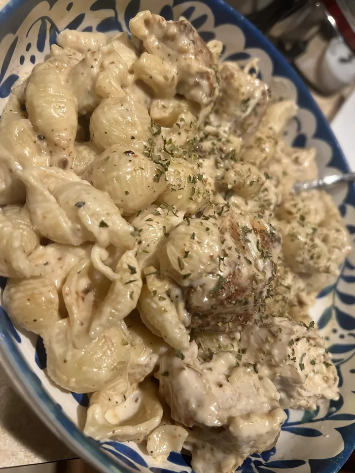
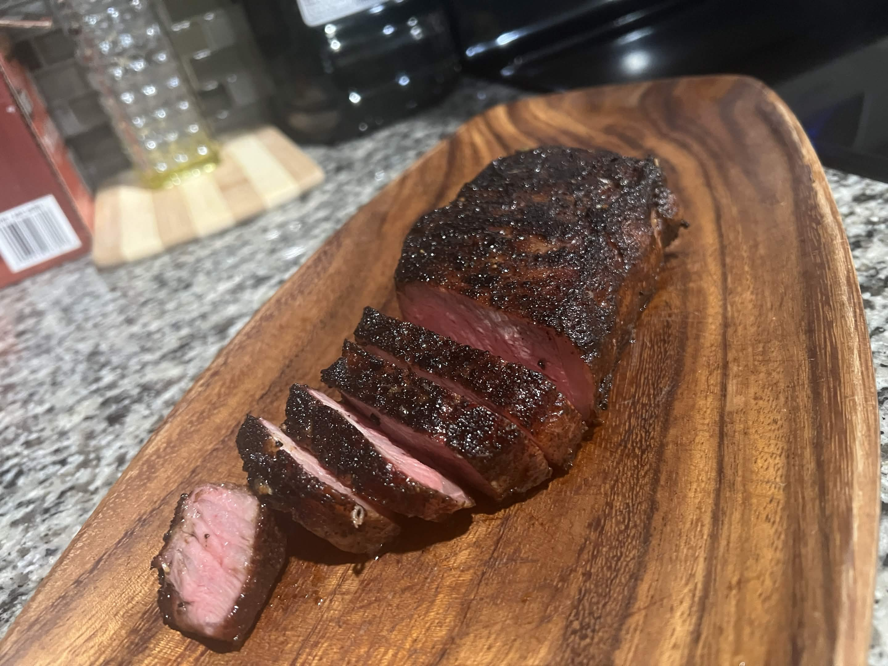
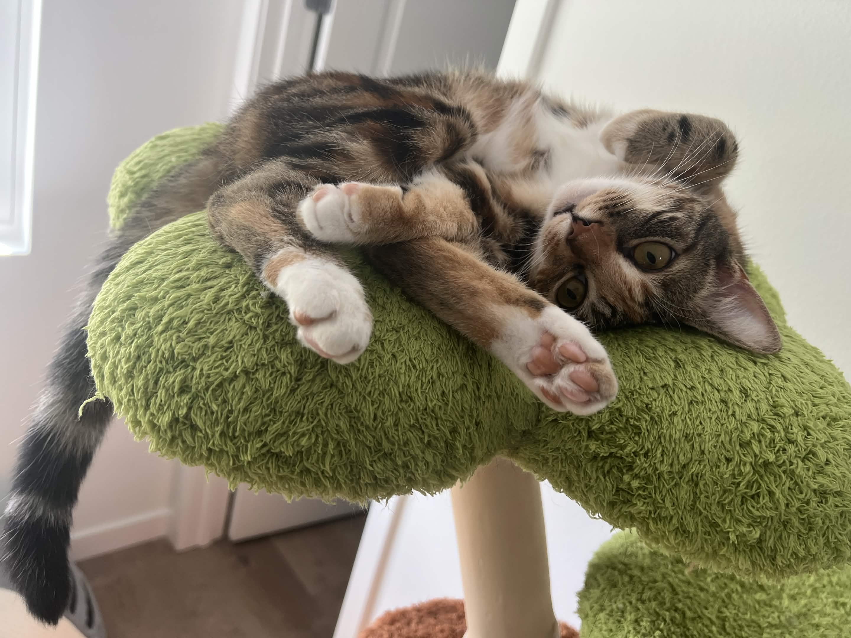
Outside the studio, I enjoy cooking various dishes, binge watching shows with my wife, and spending time with our two cats. That quieter side of life keeps me curious, grounded and attentive to the small details.
Selected work
Campaigns, editorial design, brand identity and practical production tools.
Featured Work
A focused mix of editorial, automotive, recruitment and brand-identity work.
02 · TCC / Vehlo
Direct mail and email layouts for dealership service campaigns across North America. Toyota and BMW are featured examples.
View case study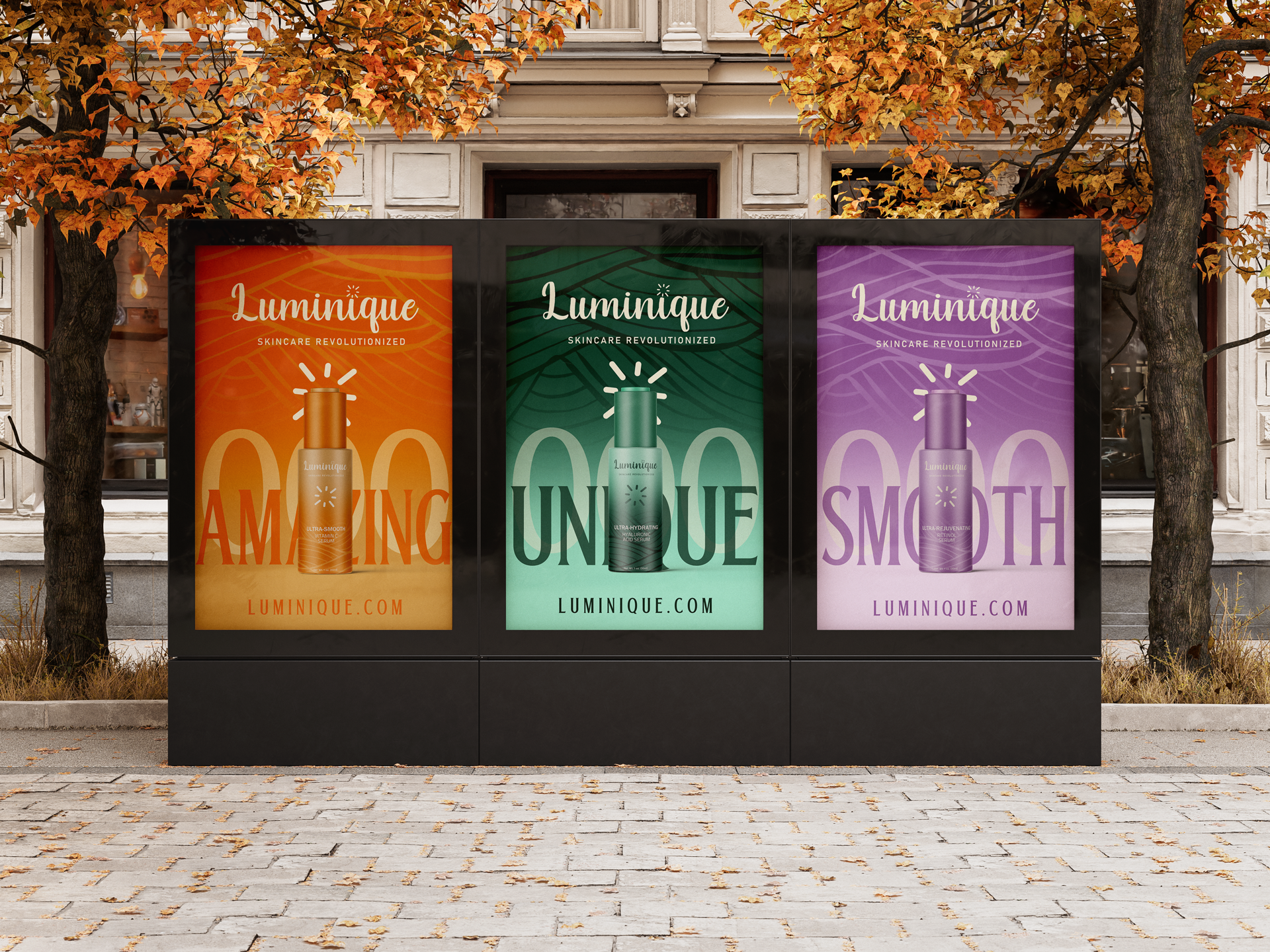
04 · Luminique
Completed beauty brand identity, packaging, campaign work and motion graphics built around expressive color and a distinctive wordmark.
View case study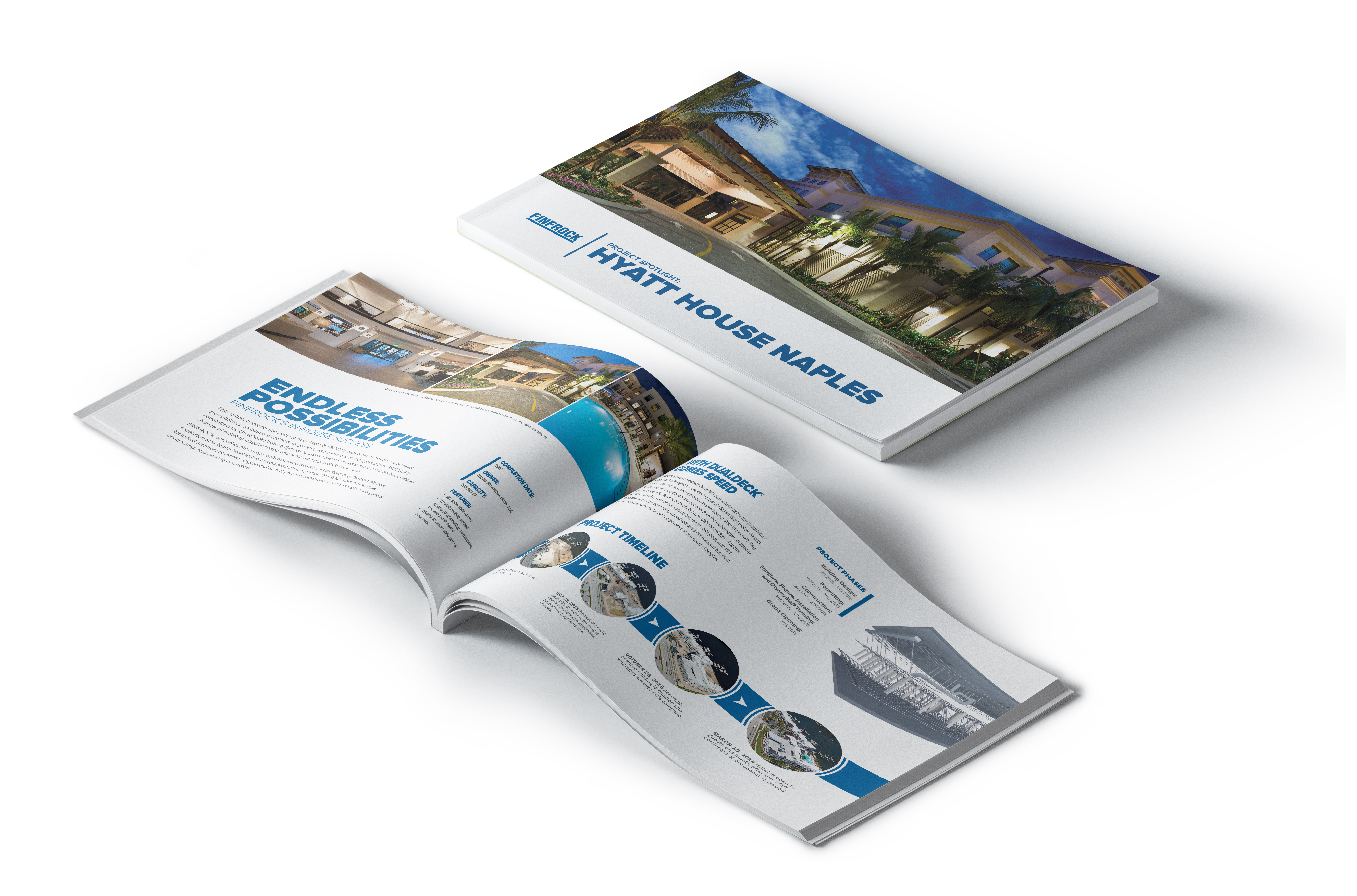
01 · FINFROCK publications
Publication design that explains FINFROCK projects through clear layouts, image sequences and project stories.
View case study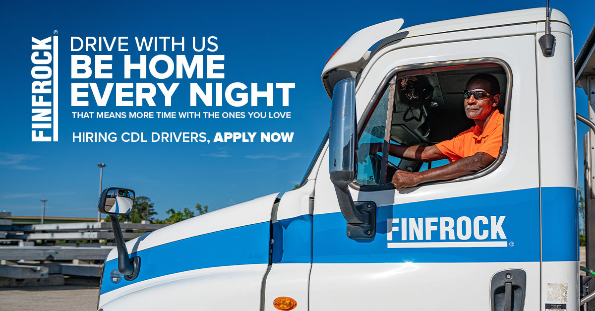
03 · FINFROCK campaigns
Recruitment and community materials adapted for specific roles, events and audiences.
View case studySupporting Work
Additional dealership campaigns, automation tools, culture work and real-estate branding.
07 · FINFROCK
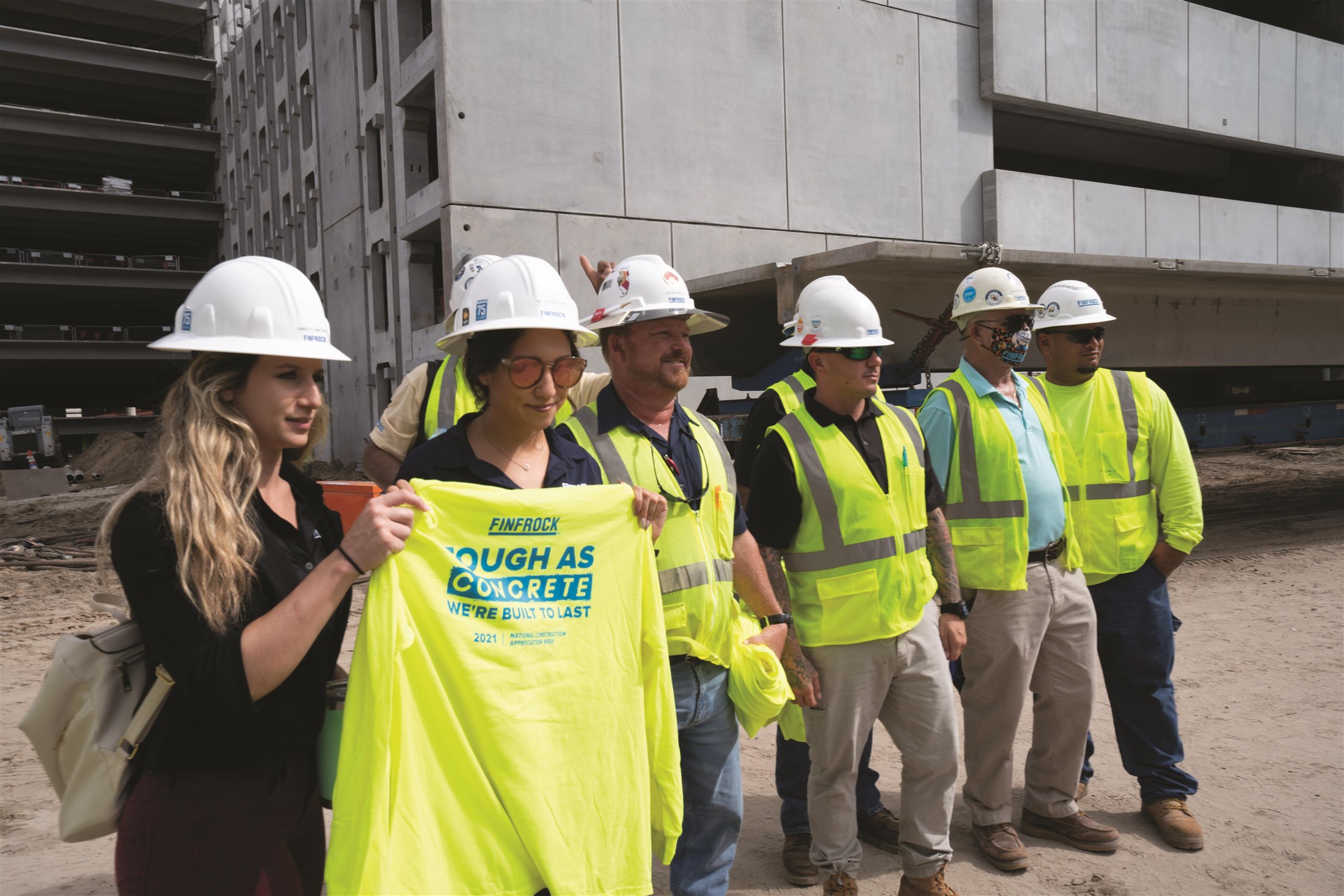
Apparel, recognition and event materials that make internal campaigns feel considered and tangible.
View case study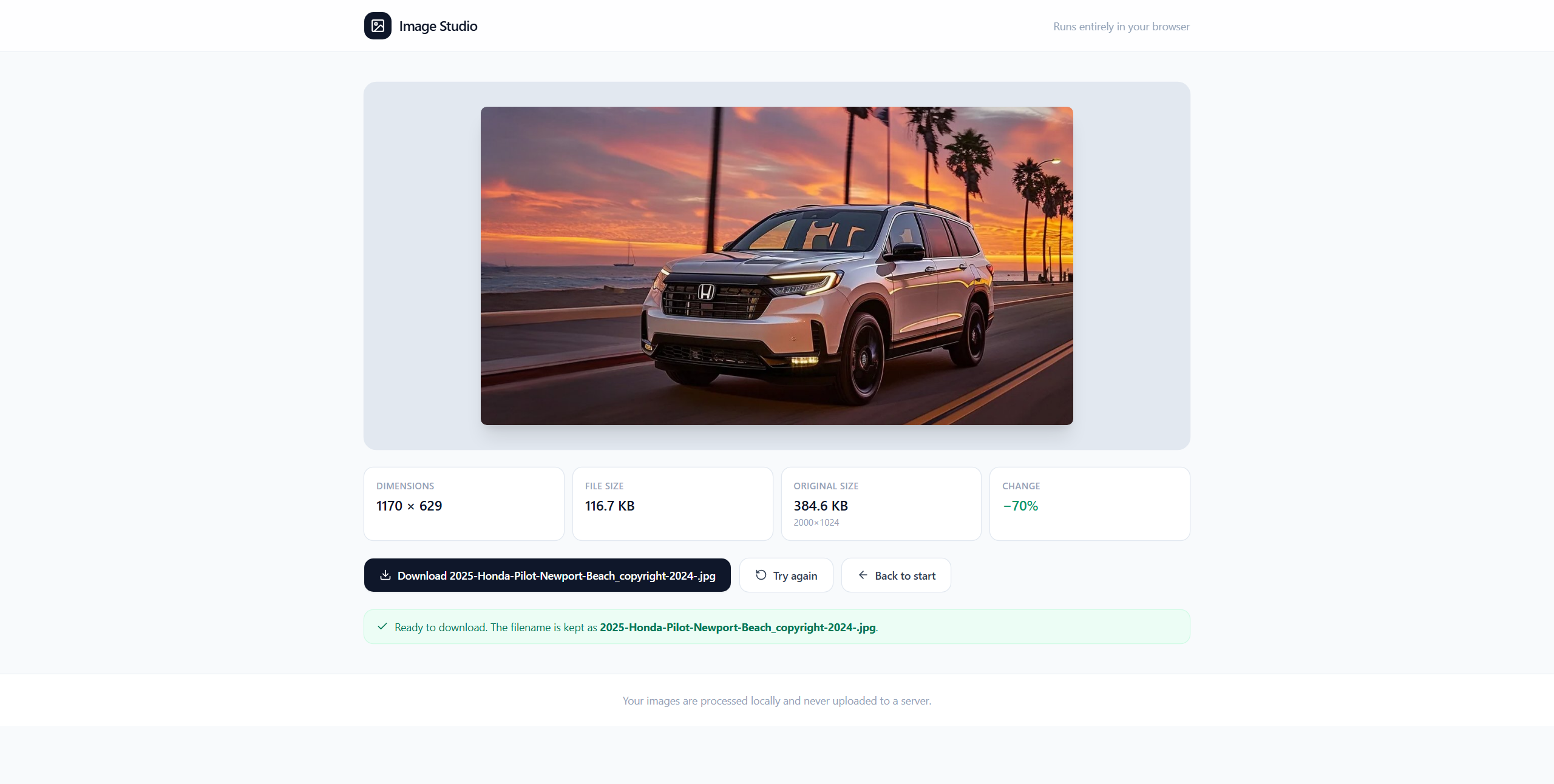
06 · Production tools
Browser tools that show a simpler path from source files and lists to useful production outputs.
View case study
05 · TCC / Vehlo
Sales emails and banner variations built to carry offers clearly while respecting each dealership brand.
View case study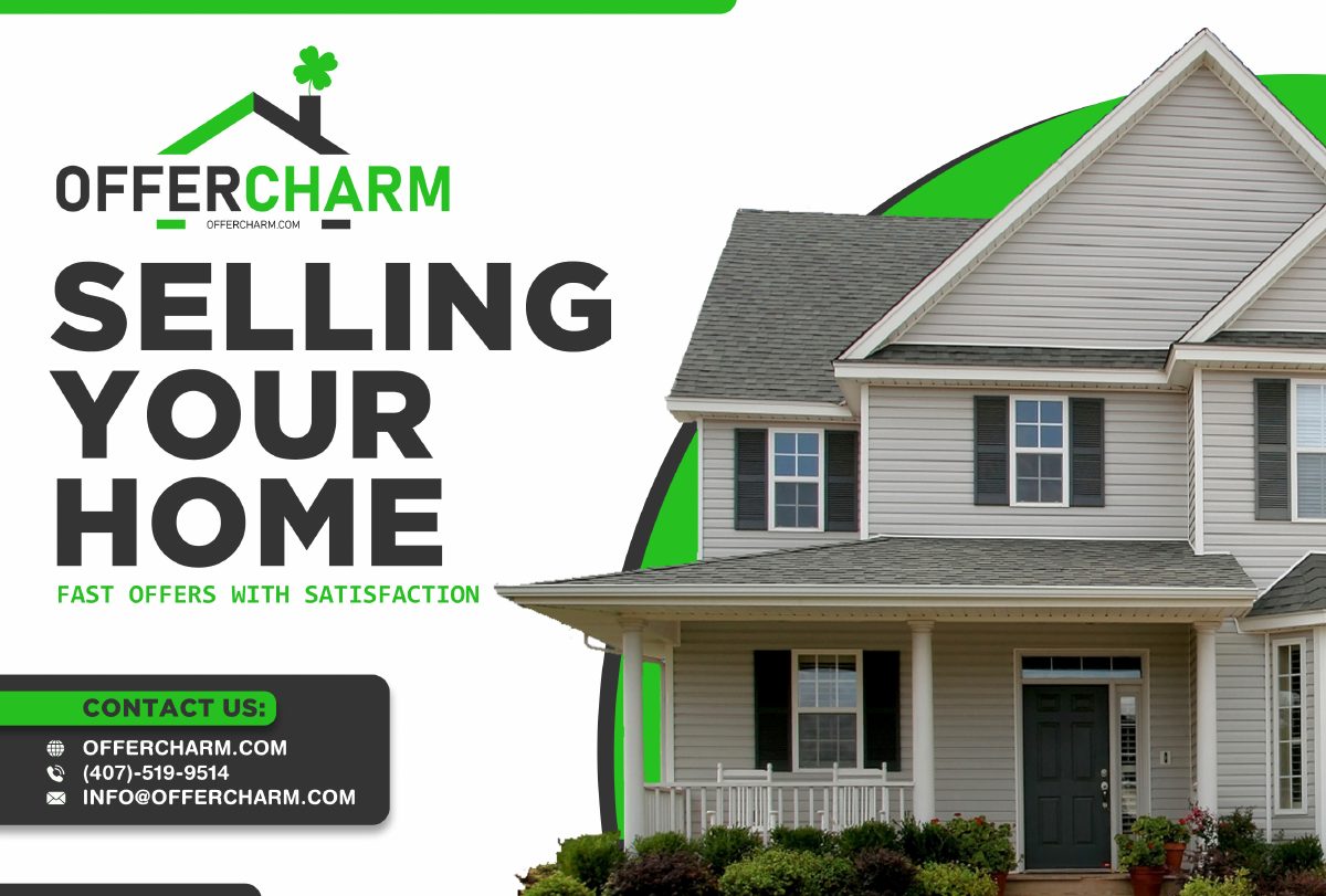
08 · OfferCharm
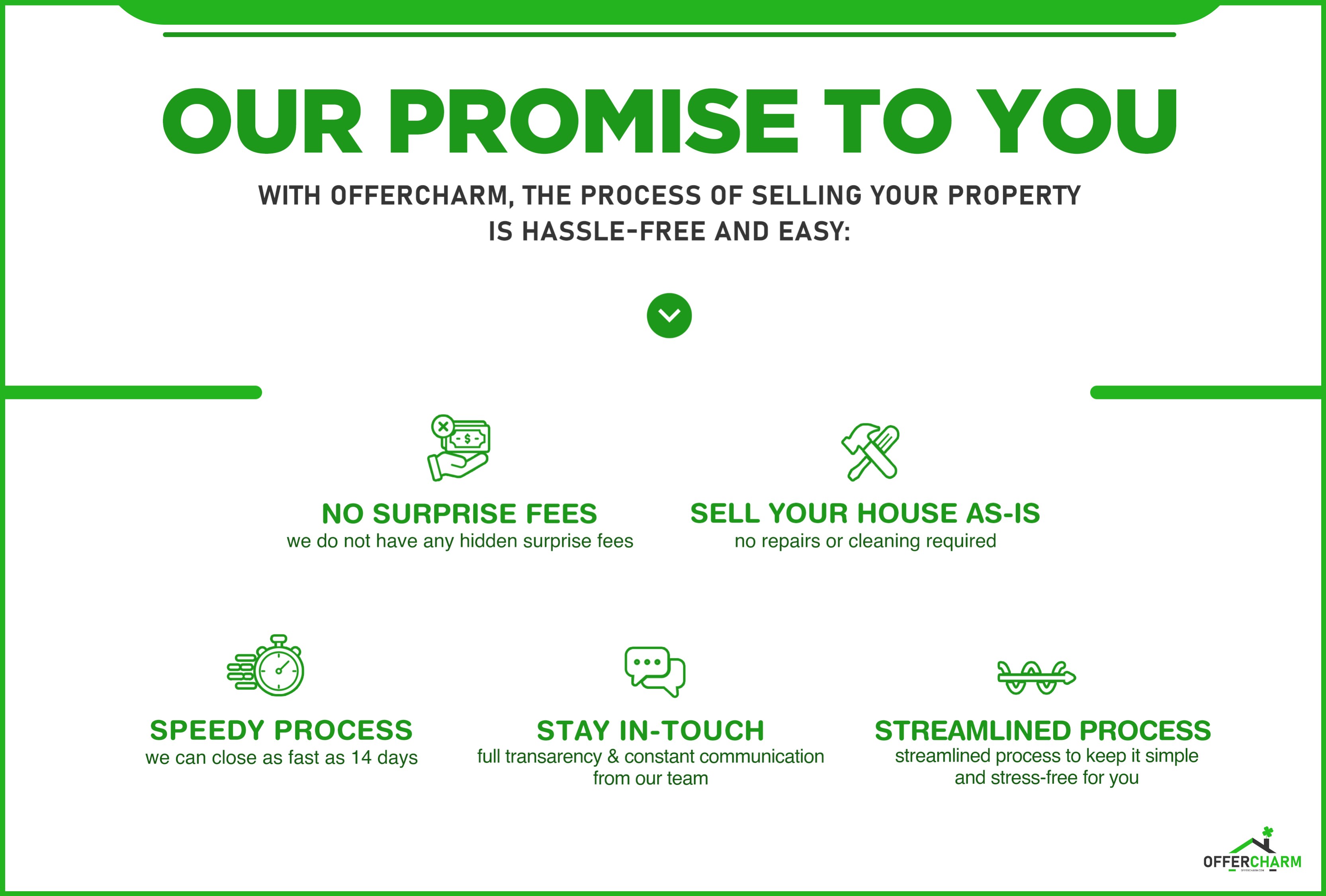
A commissioned identity and collateral suite for Shadi Tamimi’s OfferCharm and SetHomes Realty businesses.
View case studyIndependent Project
Invoices, client records, and follow-up in one workspace.
A service-business app I created with Lovable AI tool assistance that brings invoicing, client records, payment tracking, and team access together. Create invoices manually or from handwritten work orders, send them by email or text, and manage client history and follow-up in one place.
View Project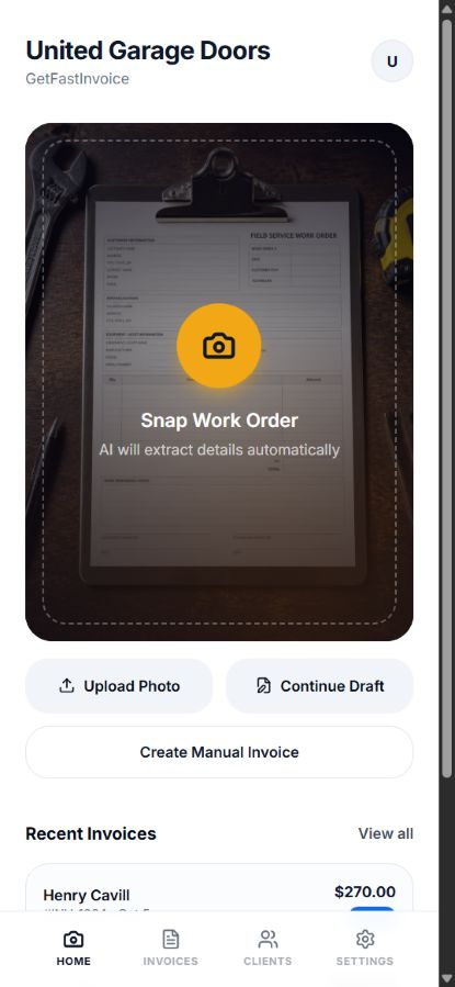
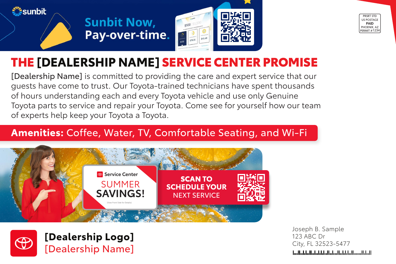
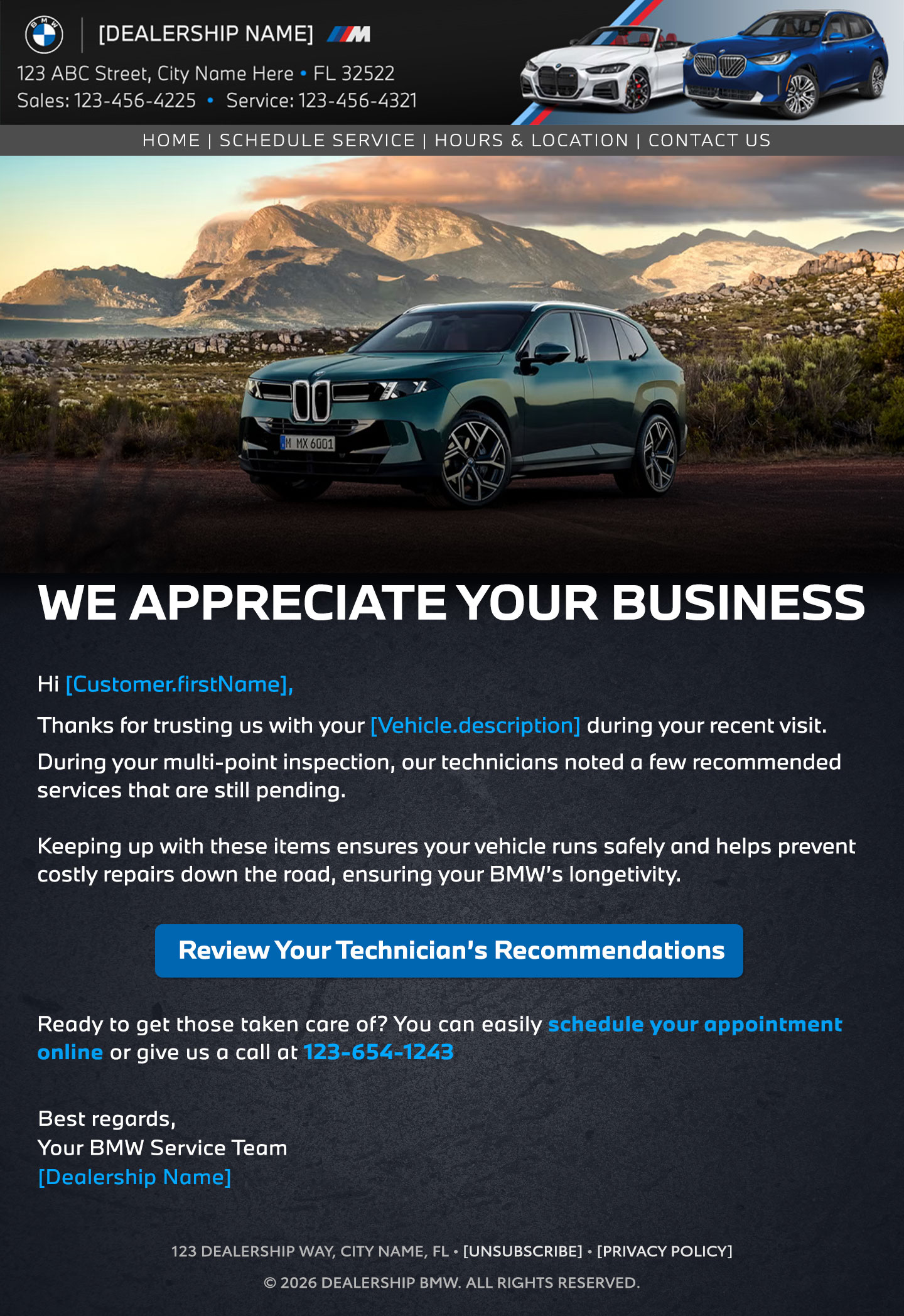
Created at TCC, a VEHLO company, for dealership clients across North America. I designed direct-mail and email layouts for service win-back campaigns; Toyota and BMW are featured examples from the broader work.
01 / Brief & constraints
Service campaigns needed to present offers, vehicle details and appointment steps clearly in both mail and email while following dealership brand requirements.
02 / My role
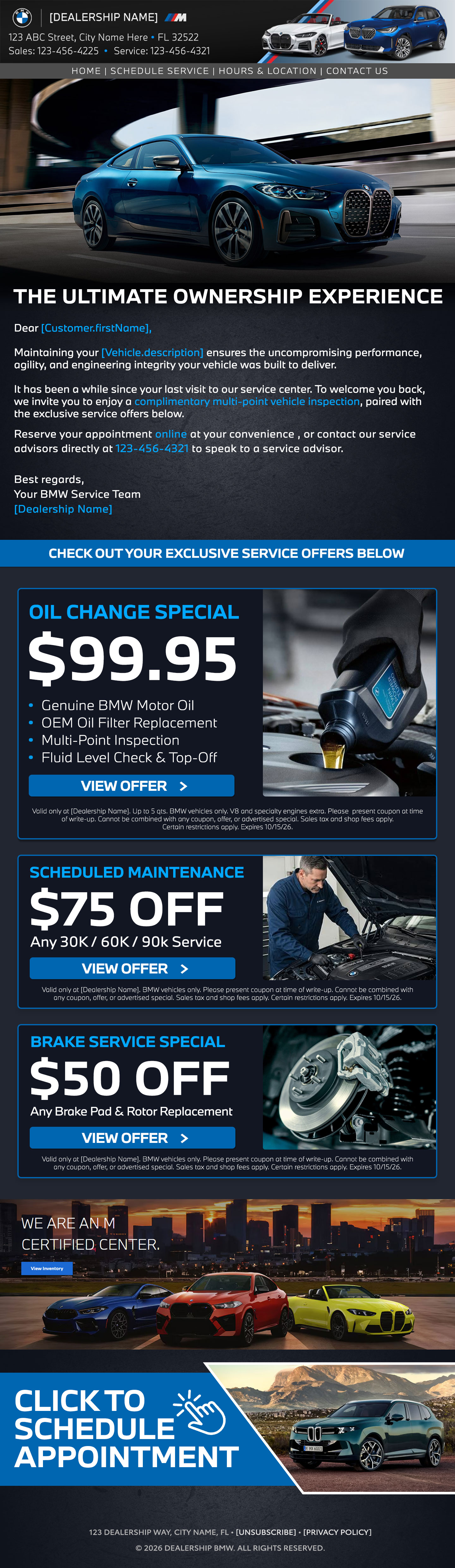
I designed the direct-mail and responsive email layouts, including offer hierarchy, visual treatment and variable customer information. I used a clear offer-first hierarchy, vehicle imagery and a consistent booking prompt so the message could scan quickly in mail or email.
03 / Practical use
The layouts supported dealership service follow-up across North America. The paired print and email examples show how the same message could carry across channels.
04 / Result
Returned customers are lapsed service customers, last serviced 6-9, 9-12, or 13-36 months earlier, who completed a service visit within 30-60 days of receiving the campaign. The direct-mail and email combinations I designed delivered combined return rates of 11% to 18%.
Decisions I made
Direct mail system
The print layouts keep offer details, customer information and booking prompts easy to scan while allowing campaign details to change.
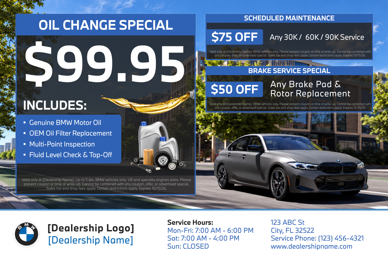
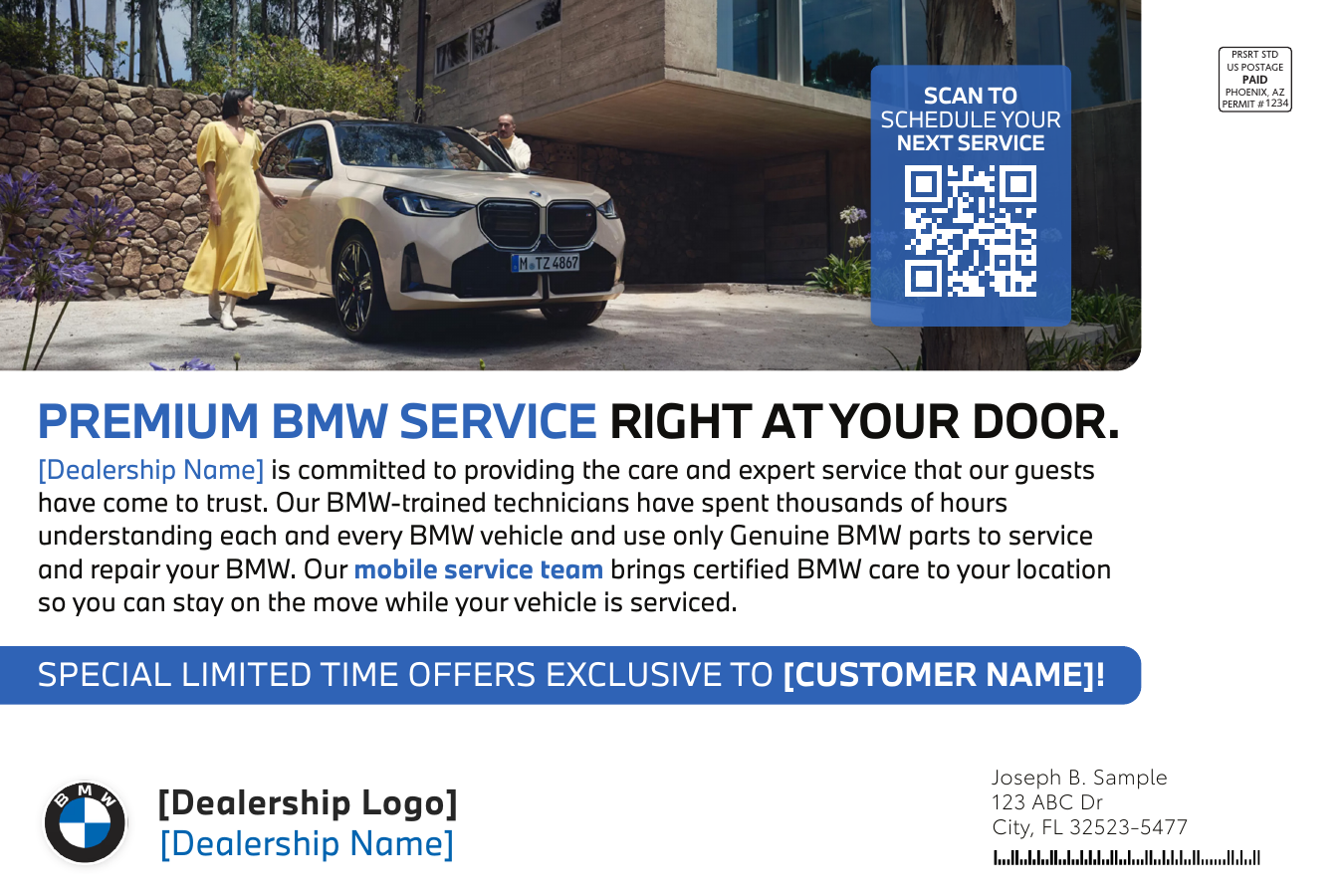
BMW service mailer
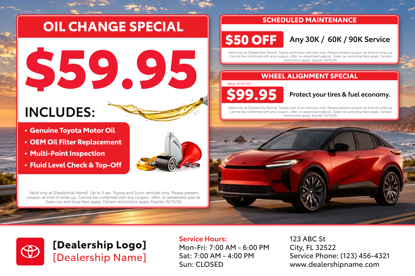
Toyota service mailer
Triggered email flows
The responsive emails carry the same offer and service information into an inbox-friendly format.
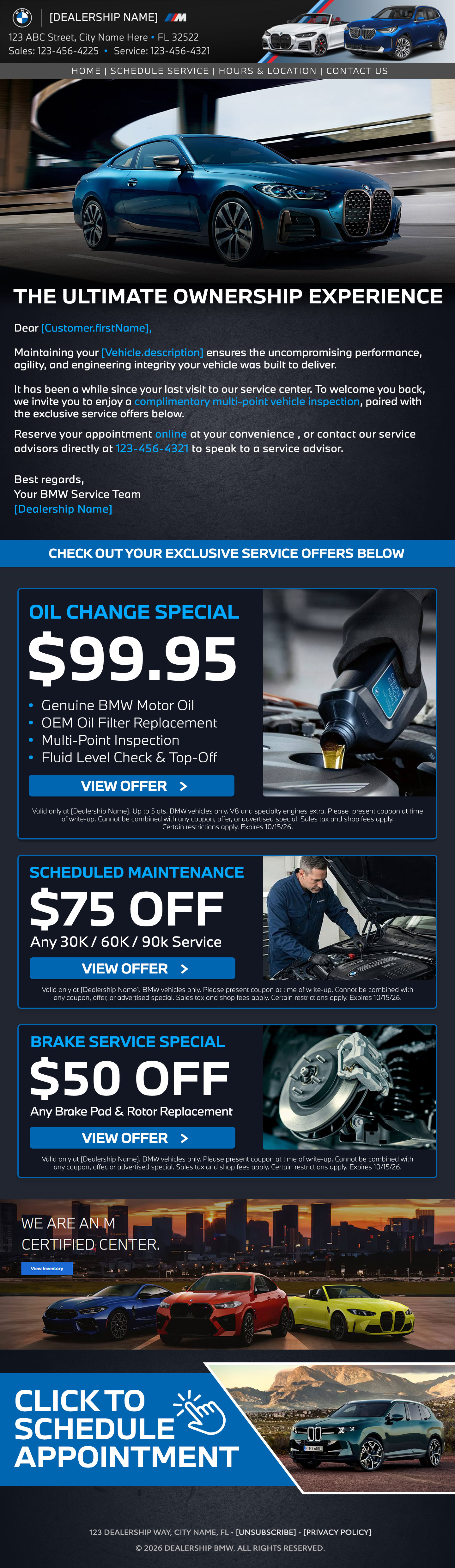
BMW triggered service flow
Full responsive email with customer recovery offers.

Toyota service email
Full responsive email with customer recovery offers.
Declined service emails
These follow-up emails bring open service recommendations back into view with a clear next step for booking.
BMW declined service email
A recovery-oriented message for open service recommendations.
Toyota declined service email
A recovery-oriented message for open service recommendations.
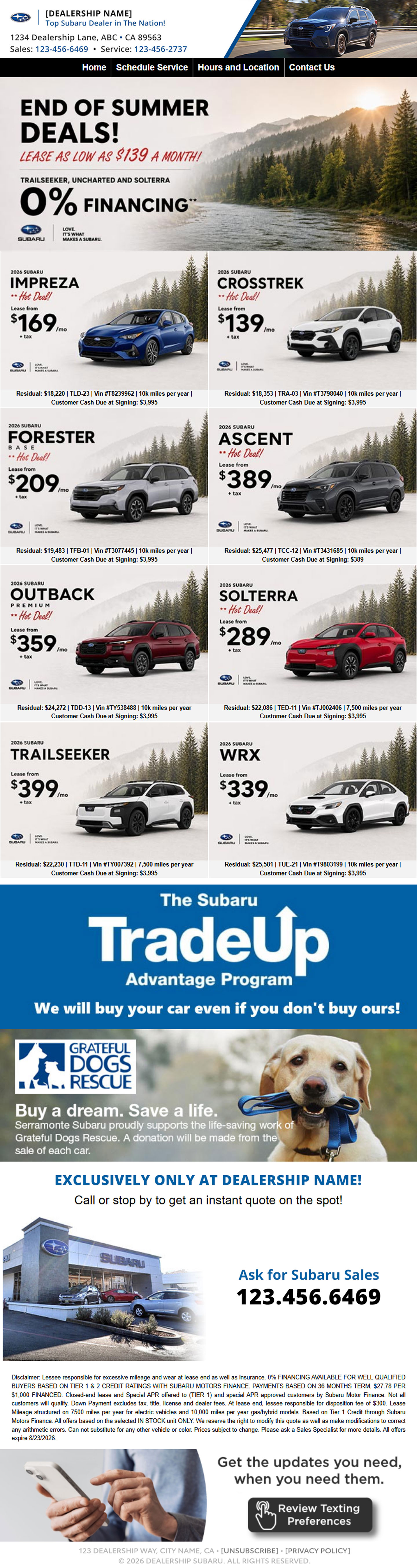
For TCC / Vehlo dealership campaigns, I designed emails and headers that make offers, inventory and next steps easier to scan. The work adapts to individual dealership brands and approved visual requirements.
01 / Brief & constraints
High-volume dealership emails had to carry inventory, offers, store details and a clear next step without losing each brand’s visual character.
02 / My role
I designed sales email layouts and banner templates, setting the hierarchy for imagery, offers, vehicle information and calls to action.
03 / Finished work
The work includes responsive sales email redesigns, before-and-after examples, and 24 banner variants across volume, premium and luxury dealership brands.
01 / Sales e-blast redesign
A visual reset for a Subaru sales email: fewer competing messages, stronger offer hierarchy and a more composed editorial presentation across the full campaign.
Before

Promotion-heavy inventory layout
Dense offers and competing visual messages.
After
Composed, brand-led sales communication
A unified offer system with clearer scanning and hierarchy.
02 / Sales e-blast redesign
A revised Route 18 campaign built around stronger offer framing, better service-category segmentation and a decisive appointment CTA.
Before

Seasonal promotion stack
A broad offer list with an inconsistent reading flow.
After
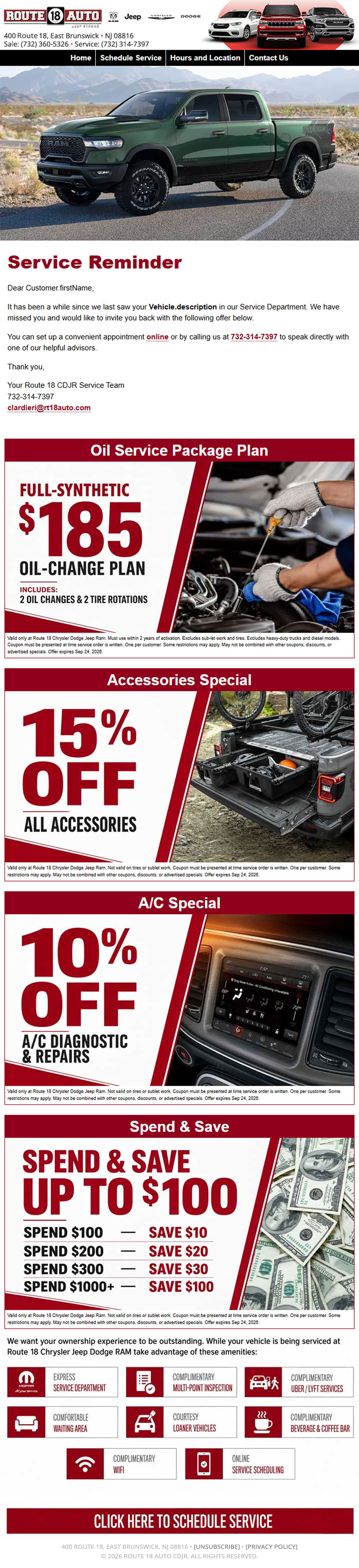
Structured service-recovery campaign
Focused offers, differentiated categories and a clear service CTA.
A library of dealership headers that keeps location details, offers and vehicle imagery legible while making room for the visual rules of each brand.
01 / Brief & constraints
The headers needed to display dealership, location and offer information while adapting to different brand requirements.
02 / My role
I designed the banner variations, deciding how typography, vehicle imagery, dealership information and calls to action should work within each format.
03 / Finished work
24 banner variants were produced across volume, premium and luxury dealership brands.
01 / Mainstream & volume
12 brand-specific header systems












02 / Premium & luxury
12 brand-specific header systems












Publication design for FINFROCK project stories. The layouts bring photography, project facts and construction milestones together in a format that is easy to read and share.
01 / Hyatt House Naples
This publication pairs hospitality imagery with project information, construction details and progress to give the Hyatt House Naples work a clear editorial story.
01 / Brief & constraints
The publication needed to cover hospitality interiors, a waterfront setting, construction phases and building details without becoming difficult to follow.
02 / My role
I designed the publication layouts, visual hierarchy and sequencing of imagery, plans, milestones and construction details. Full-bleed photography establishes the setting, while measured typography and structured spreads make project facts easier to follow.
03 / Finished work
The finished publication gives project information, imagery and building details a single, well-structured home.
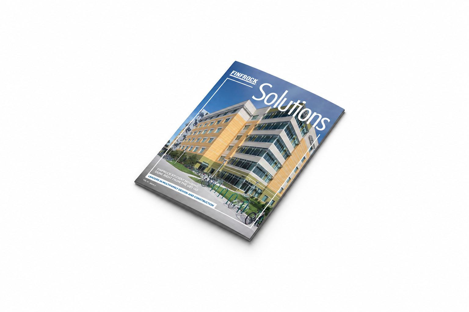
02 / FINFROCK Solutions
The Village at USF publication presents a large student-housing project through its delivery timeline, building method and student-living details.
01 / Brief & constraints
The piece needed to explain a phased delivery schedule, construction method and student-housing experience in a compact printed format.
02 / My role
I designed the tri-fold layout and the reading order for the project story, milestone information, imagery and supporting diagrams.
03 / Finished work
A six-panel publication that connects the delivery timeline, building method and resident experience in one piece.
Publication mockup
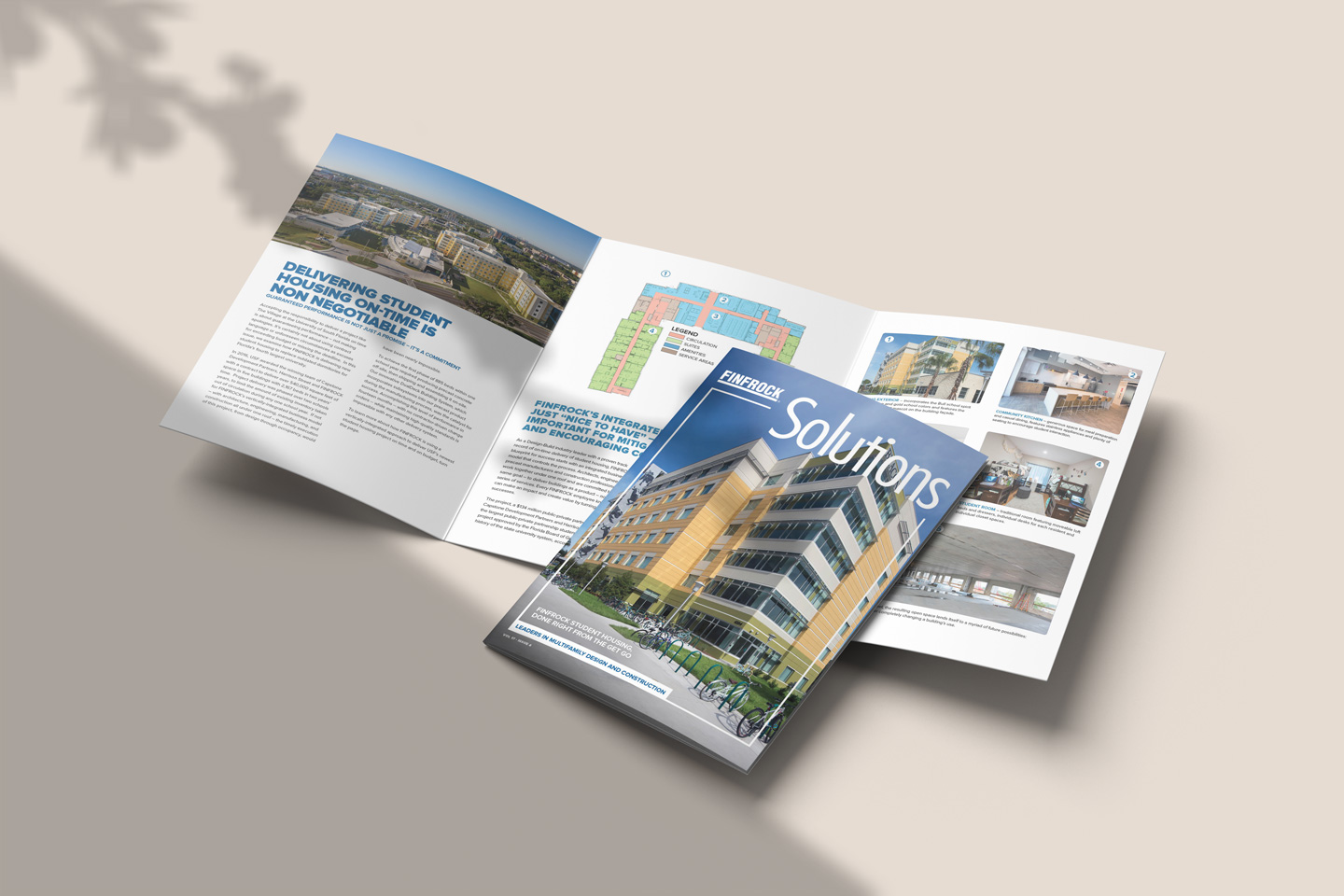
Tri-fold layout
From the delivery promise to project milestones, each side keeps the narrative, proof and people-facing details in view.
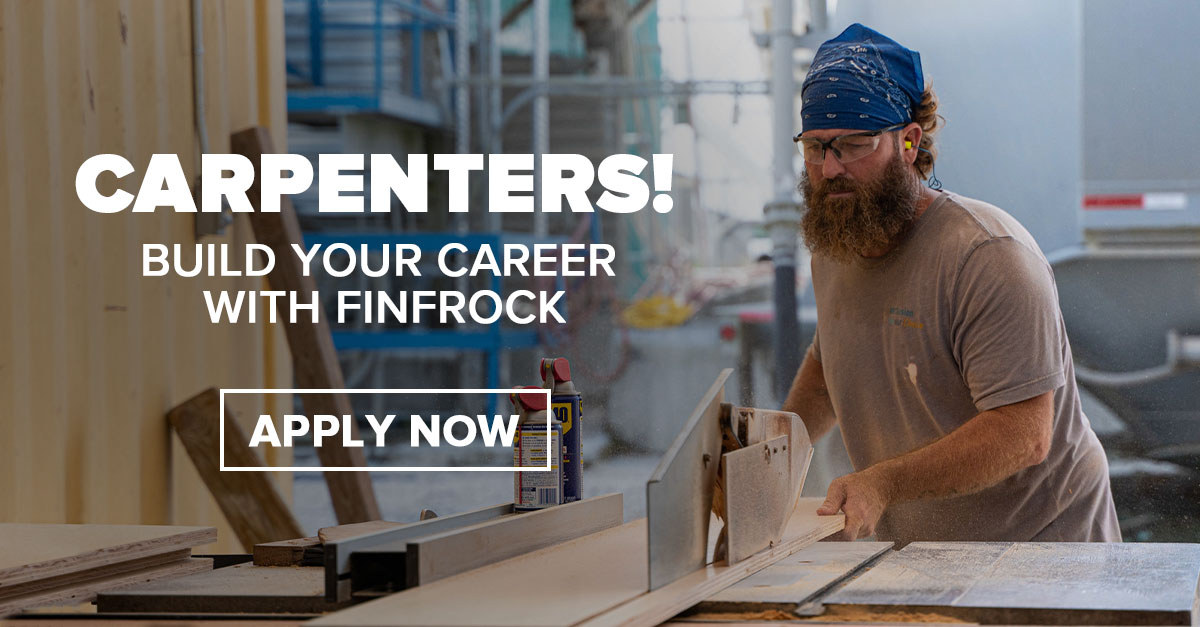
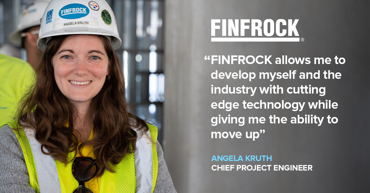
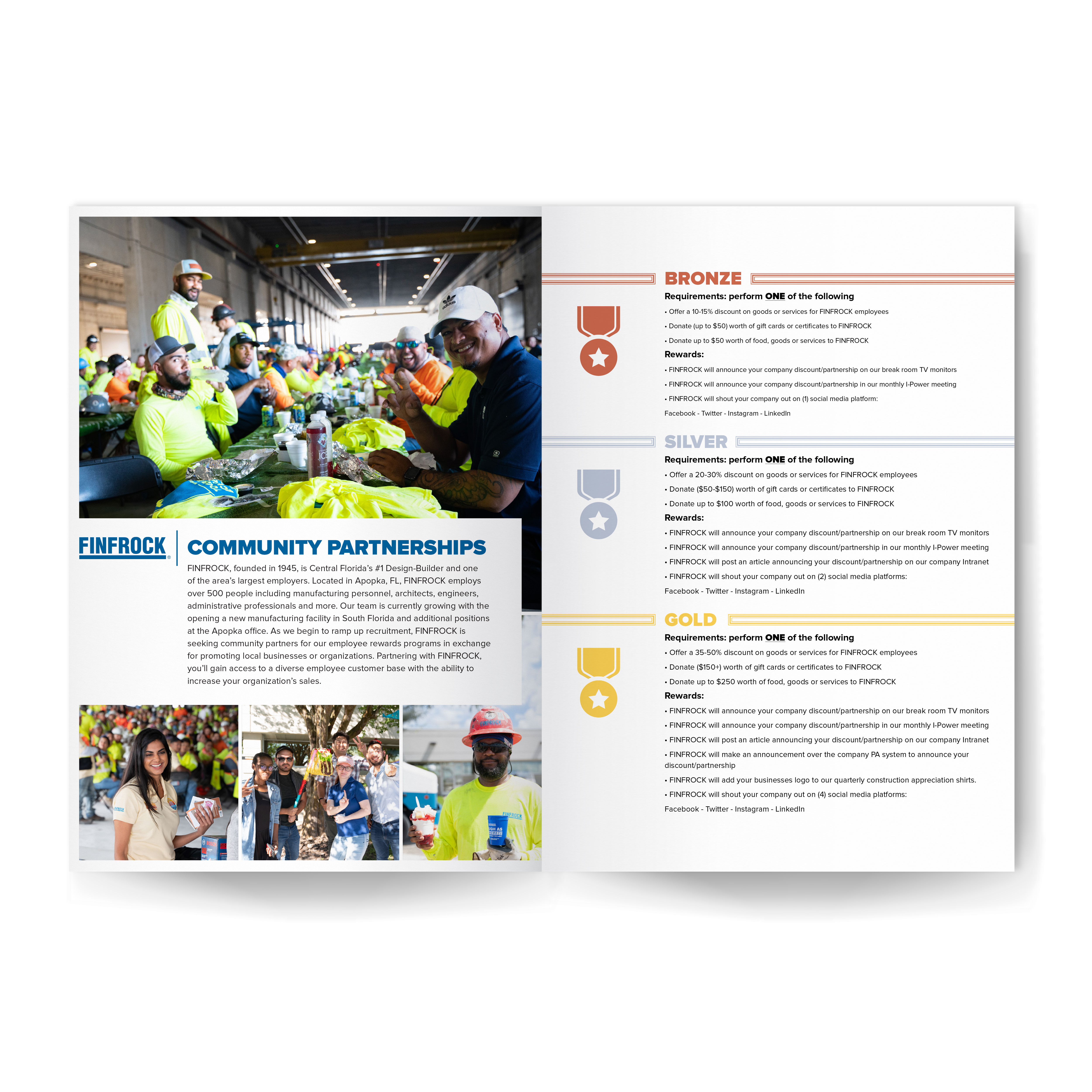
Recruitment and community materials for FINFROCK, designed to make the role, message and next step easy to understand.
01 / Brief & constraints
Each campaign needed to speak to a different role or community effort while remaining recognizably FINFROCK.
02 / My role
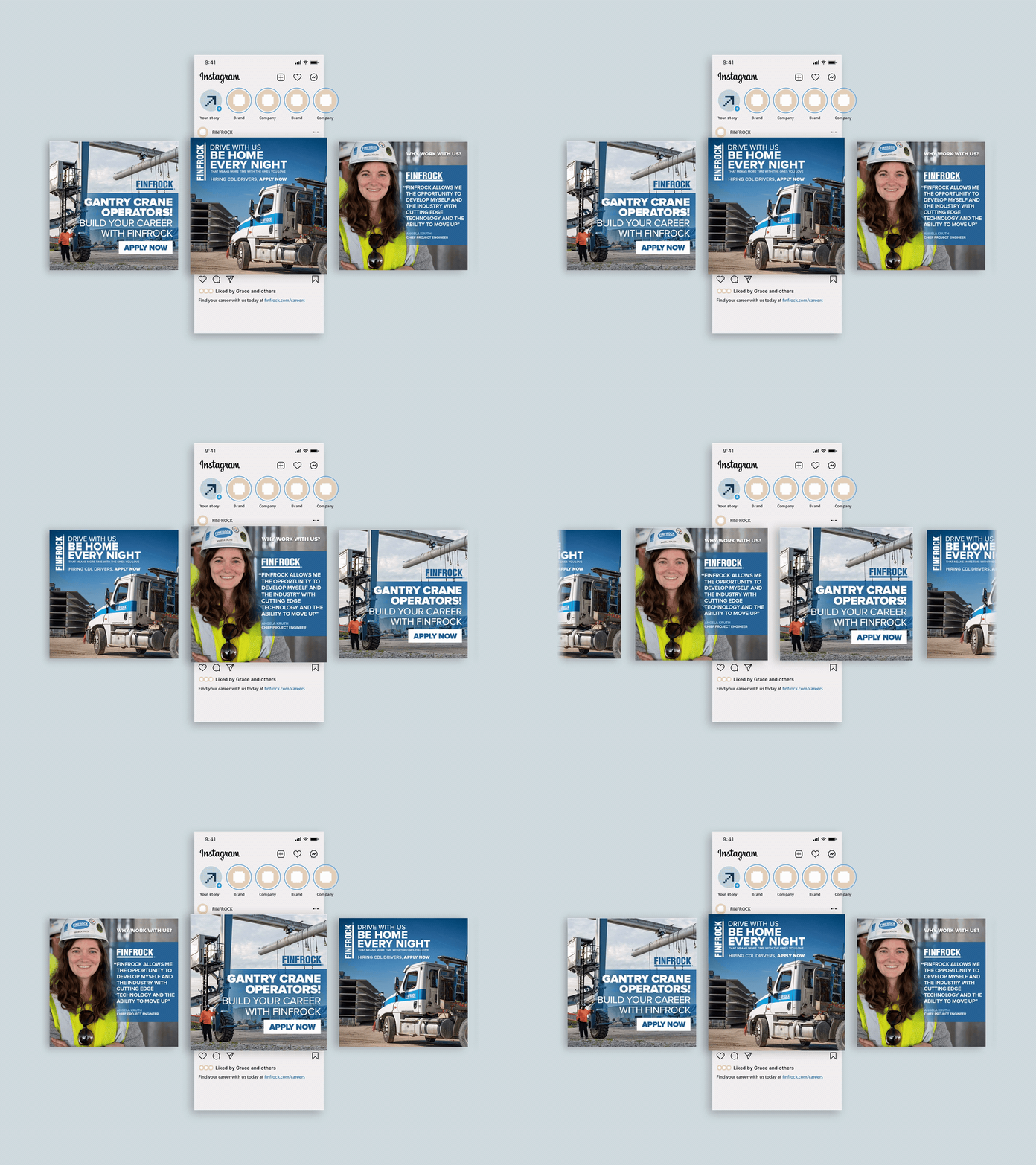
I designed the campaign layouts, pairing jobsite photography, role-specific messages and clear calls to action across advertising and print materials.
03 / Finished work
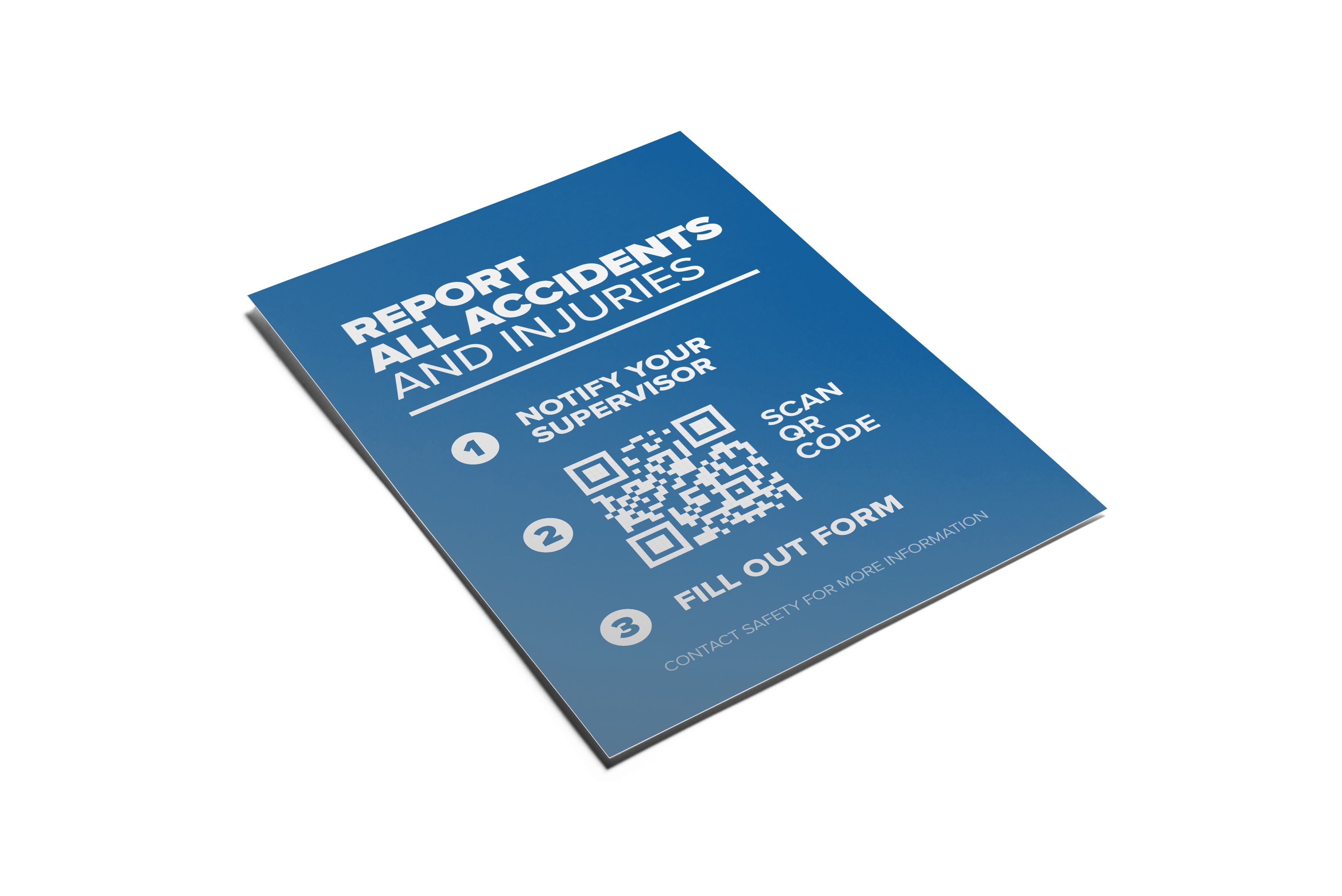
The finished work includes driver, carpenter and engineering recruitment ads, social motion, a development brochure, a safety card and community collateral.
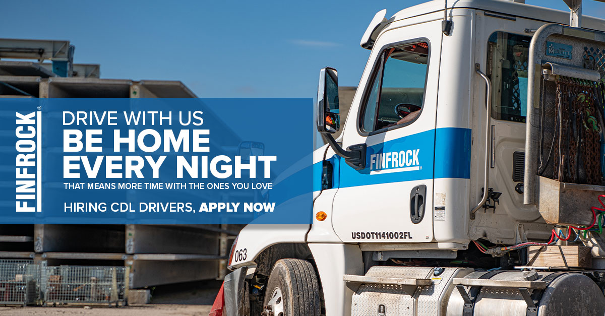 01 / 04
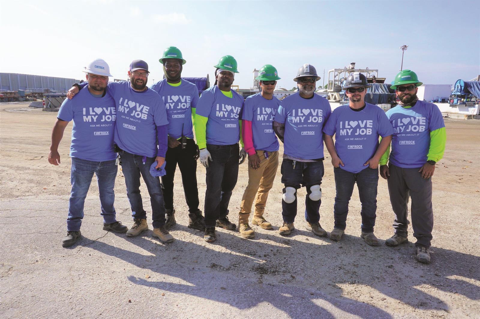
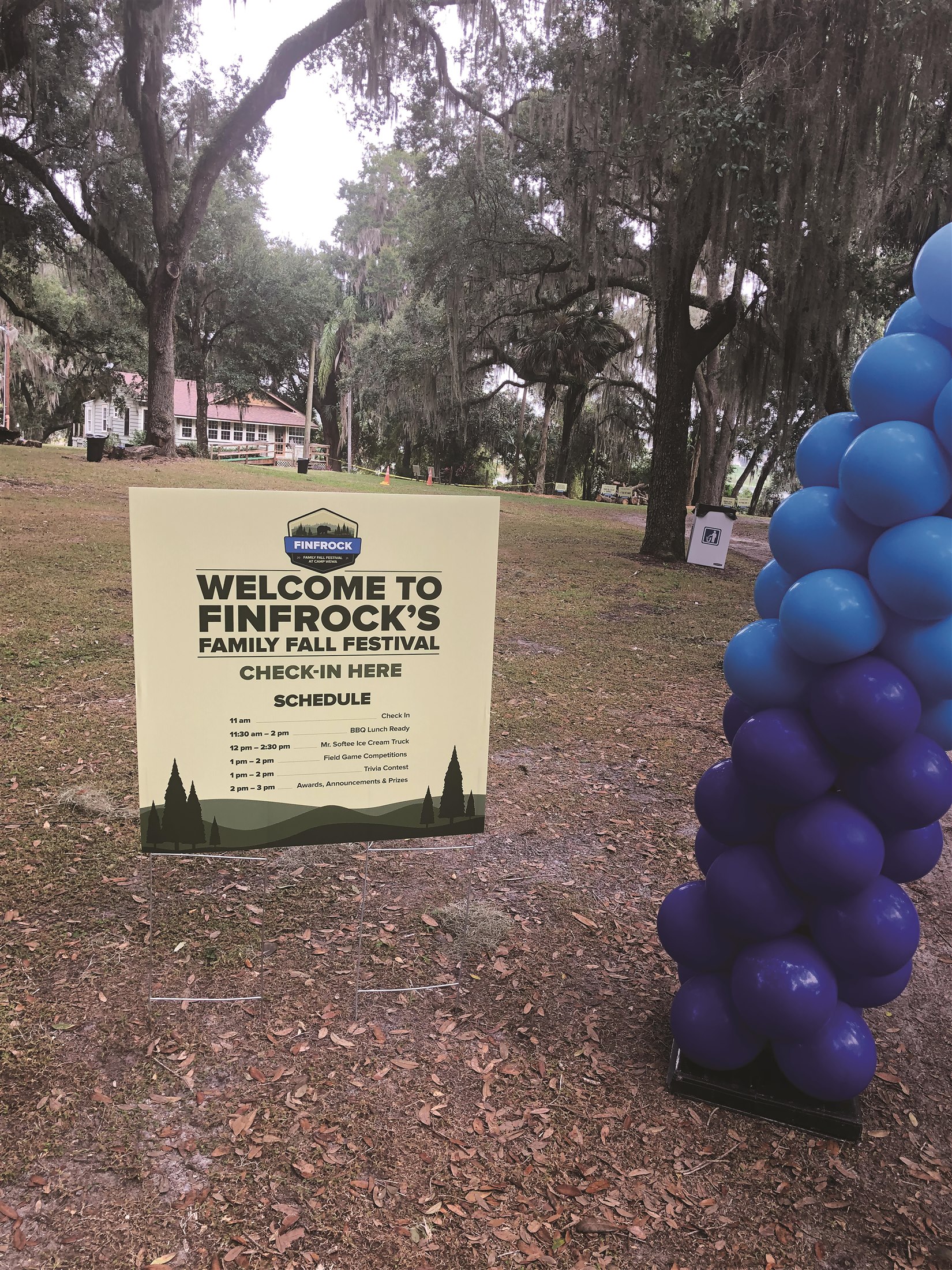
Apparel, photography, recognition and event materials for FINFROCK employees and community moments.
01 / Brief & constraints
The work needed to translate recognition moments and community events into items people could wear, use and see on site.
02 / My role
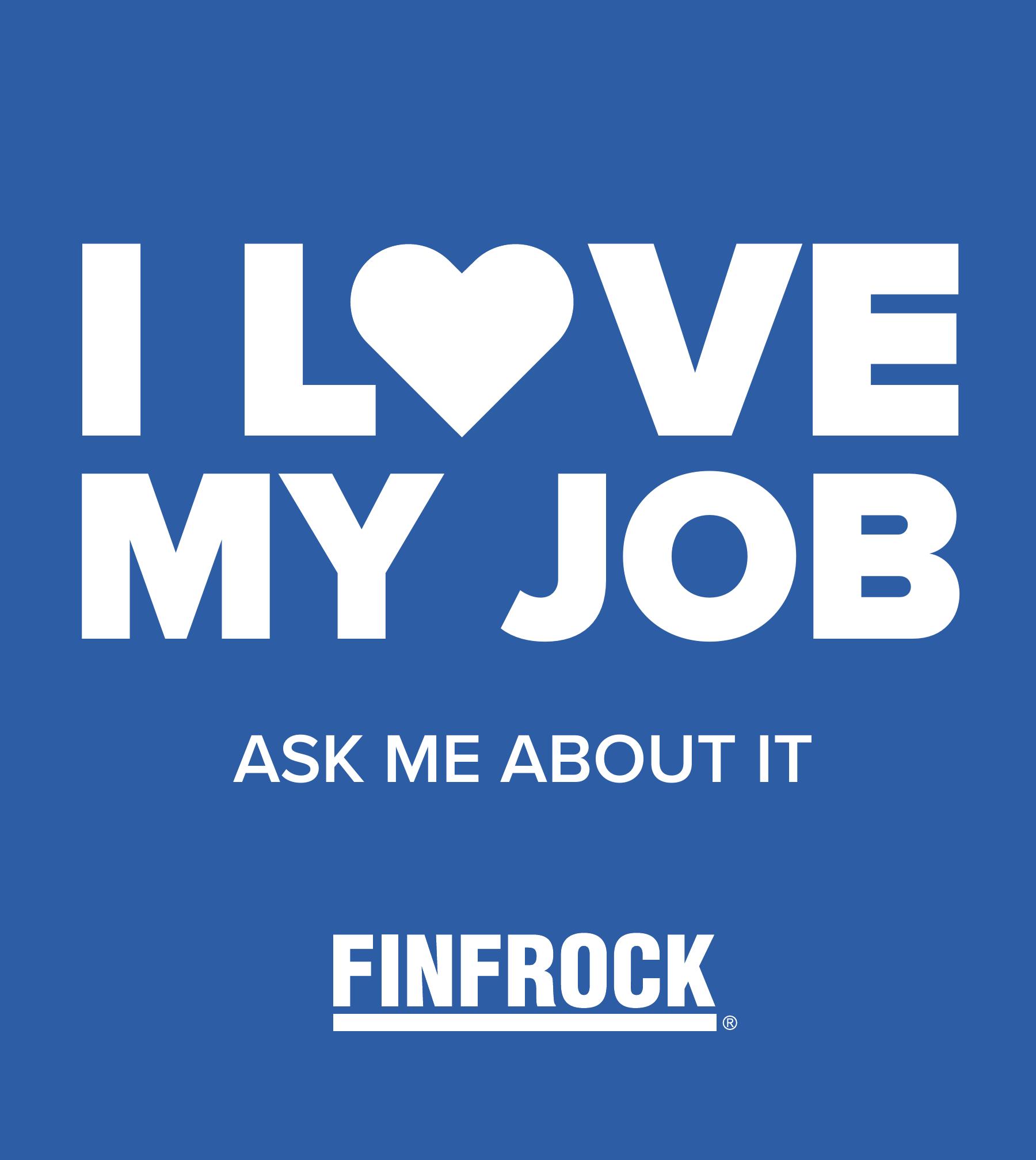
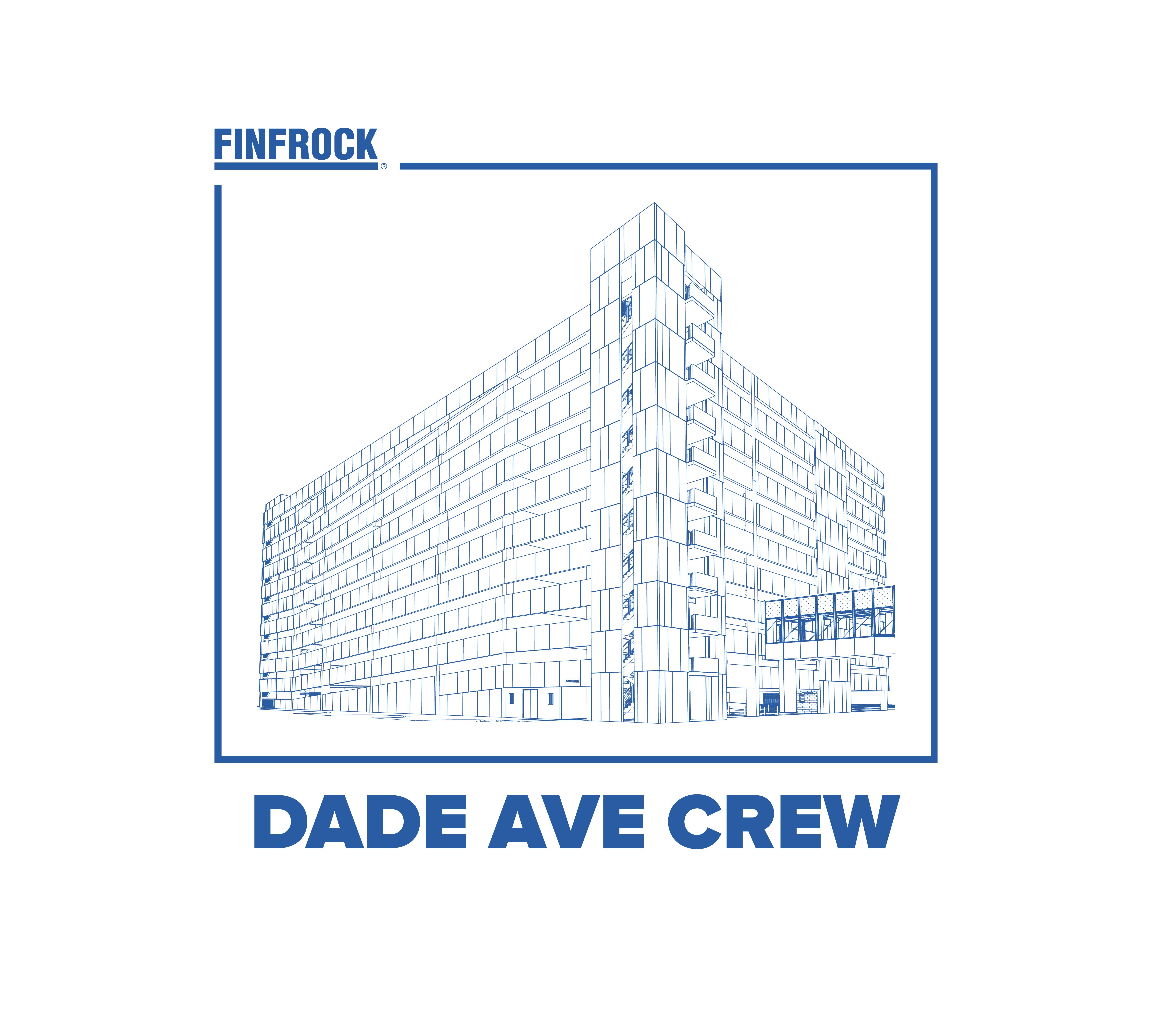
I designed the apparel graphics, recognition materials and event touchpoints shown here, adapting each idea to its physical format.
03 / Finished work
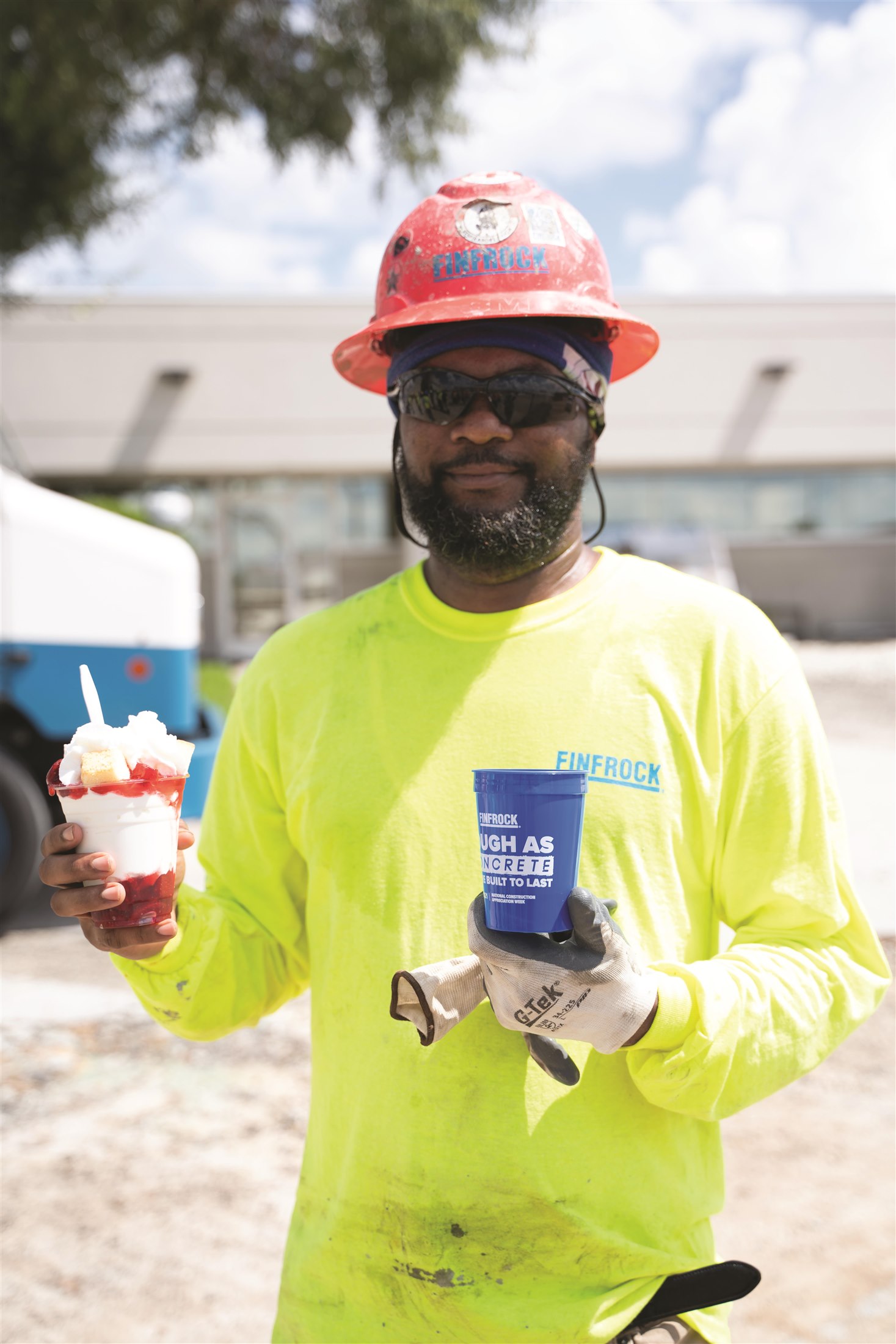
Finished applications include shirts, appreciation items, event signage and supporting photography of the work in use.
Design
In use
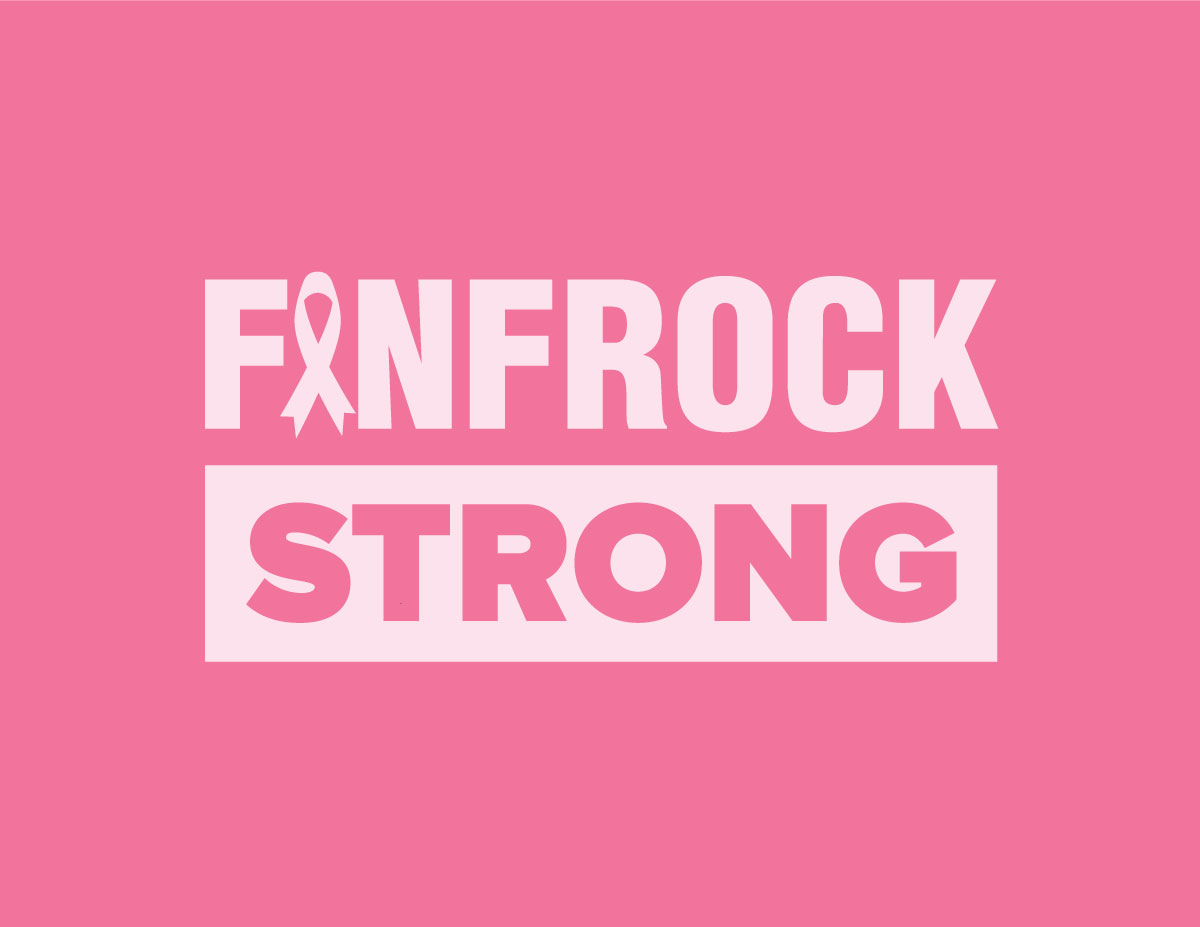
Design
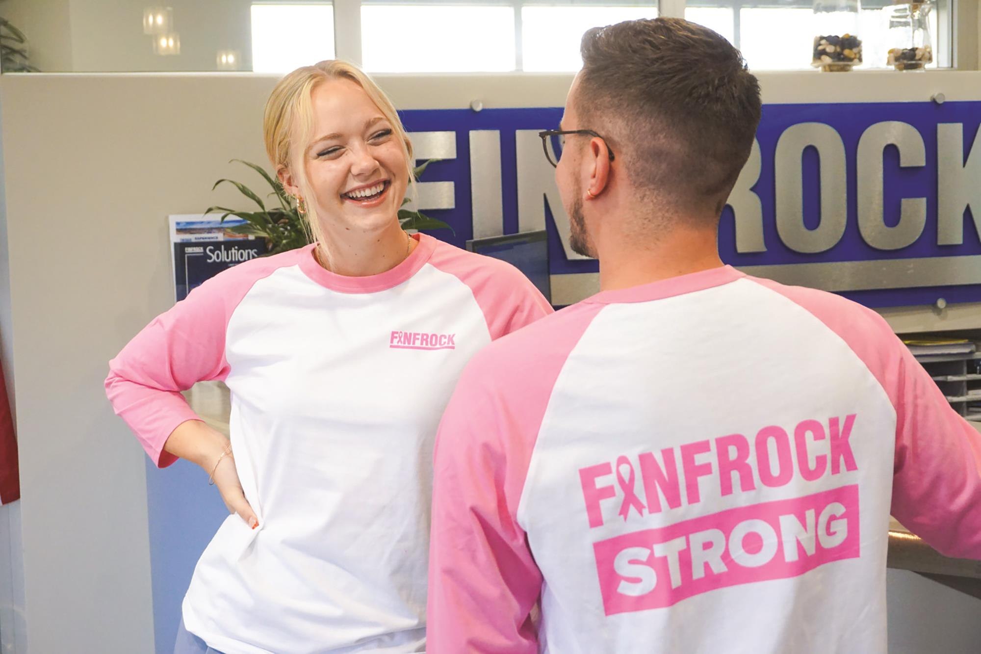
In use
Additional moments
Supporting photography and event work without a one-to-one design counterpart, kept together as a concise record of FINFROCK culture in action.
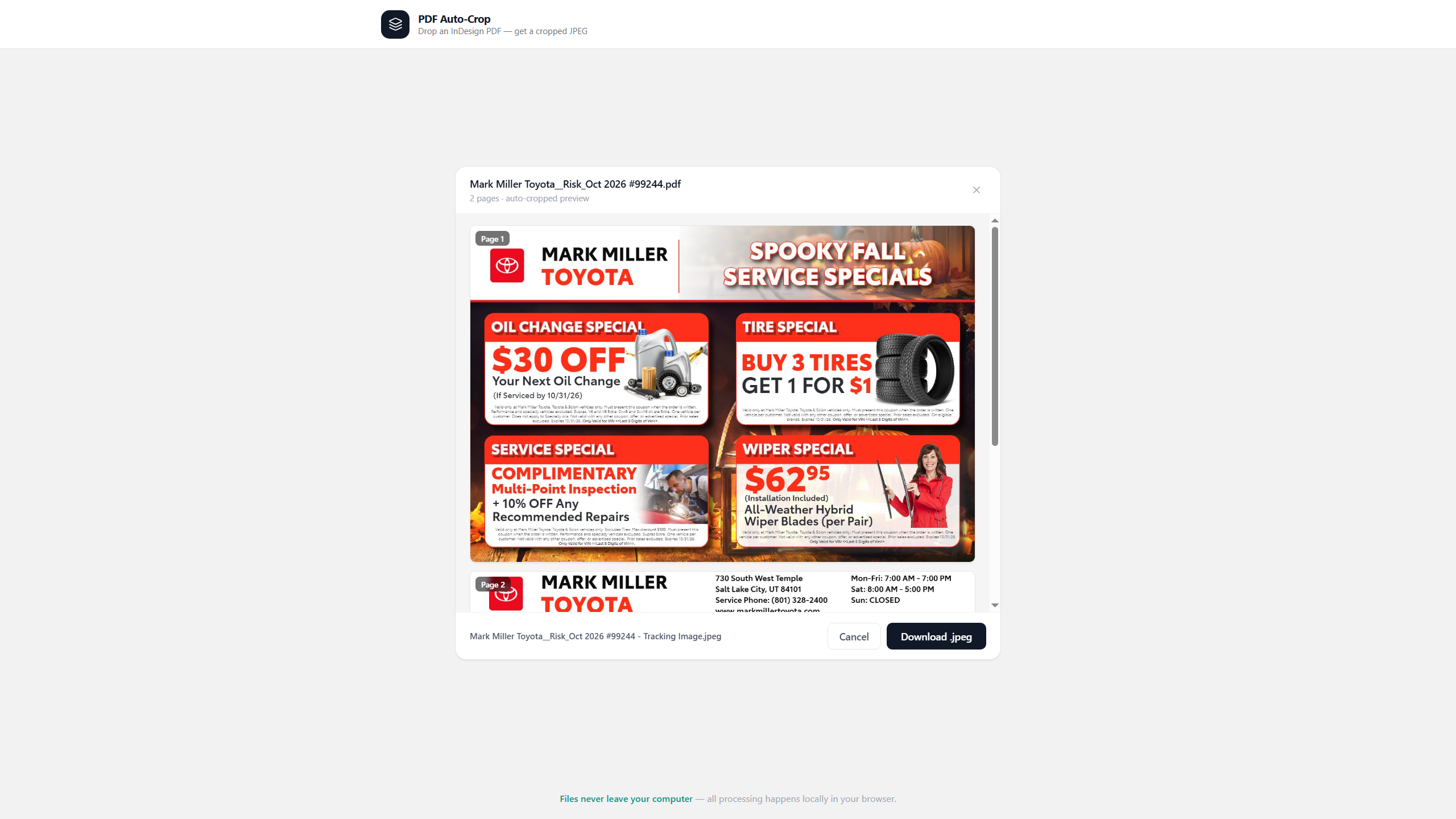
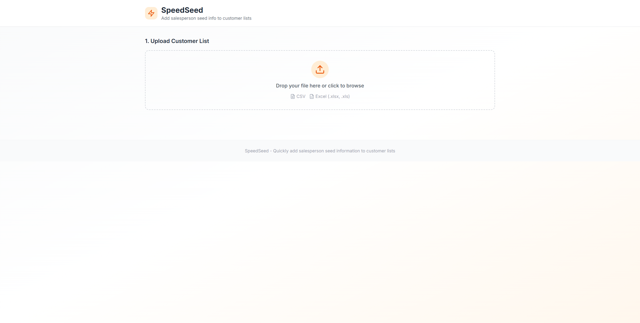
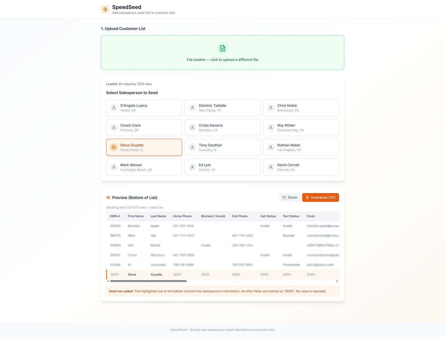
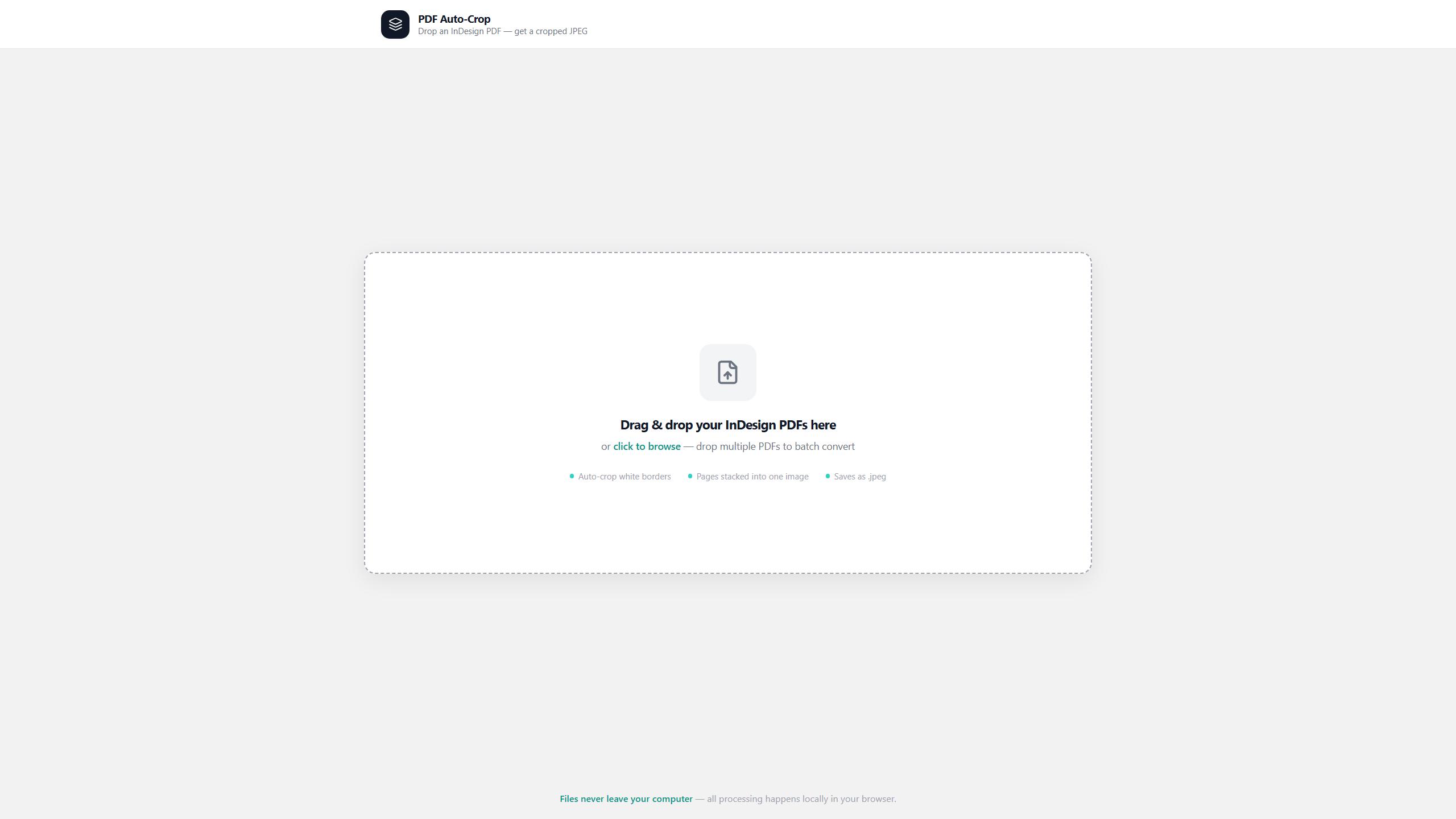
Three production tools I created for repeated tasks that slow campaign delivery: proof preparation, seed-list updates and image output. Reduced send-to-print preparation time by approximately 75%, from about 12 minutes to 3 minutes.
01 / Previous workflow
Before a mailer could move to print, designers had to open and crop each approved proof, save it, download the seed file, enter salesperson data by hand, save again and then release the job.
02 / My role
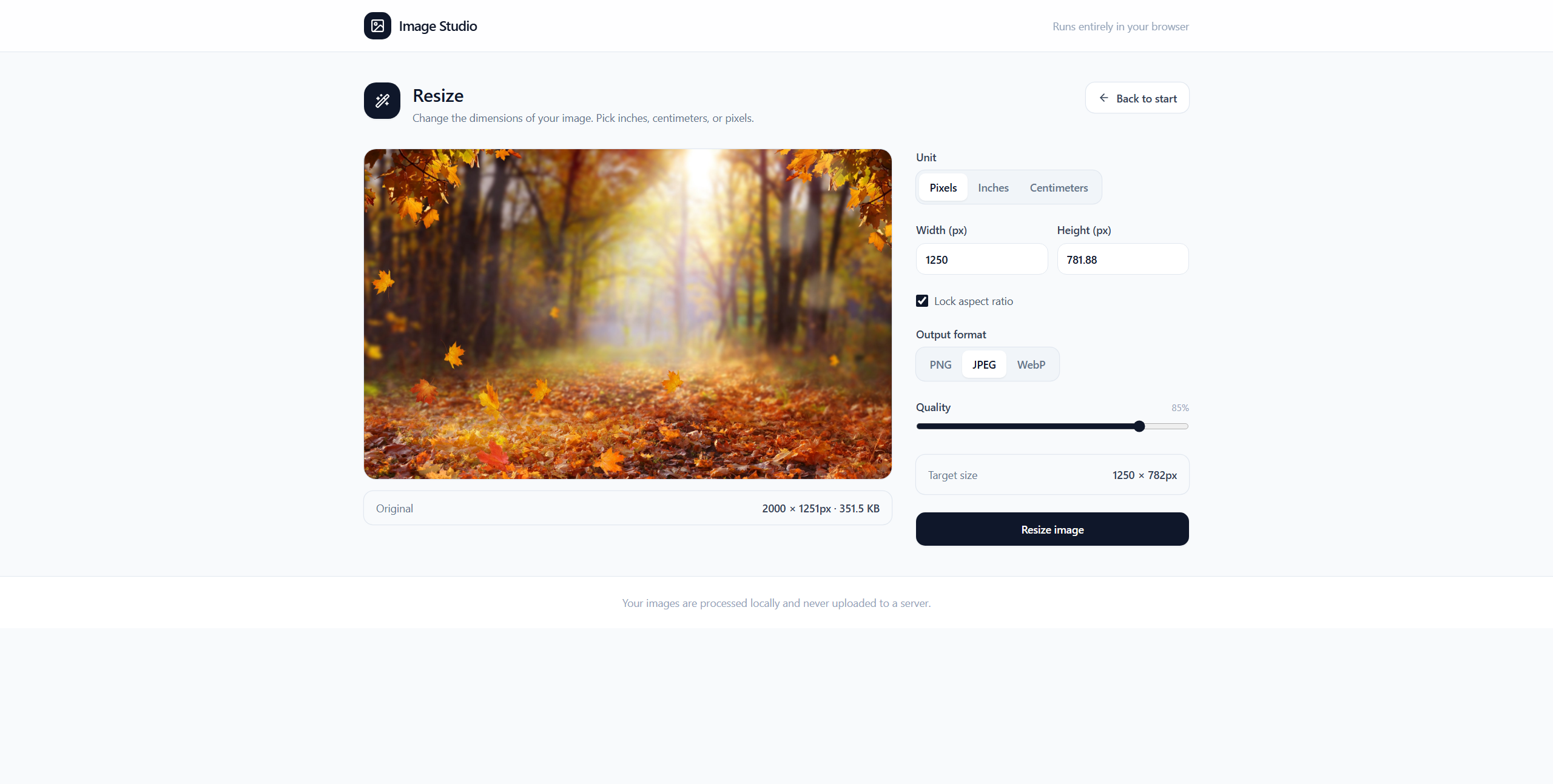
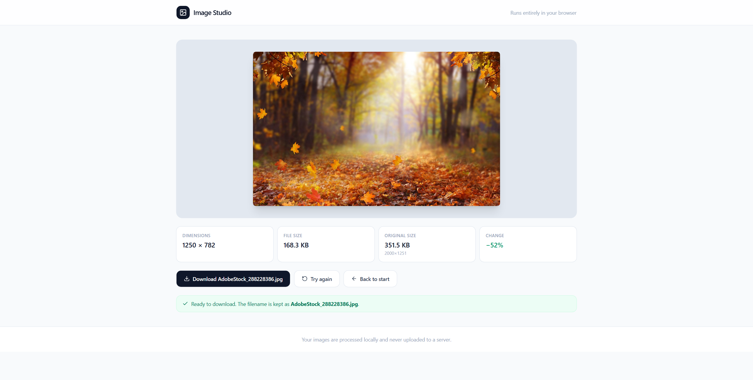
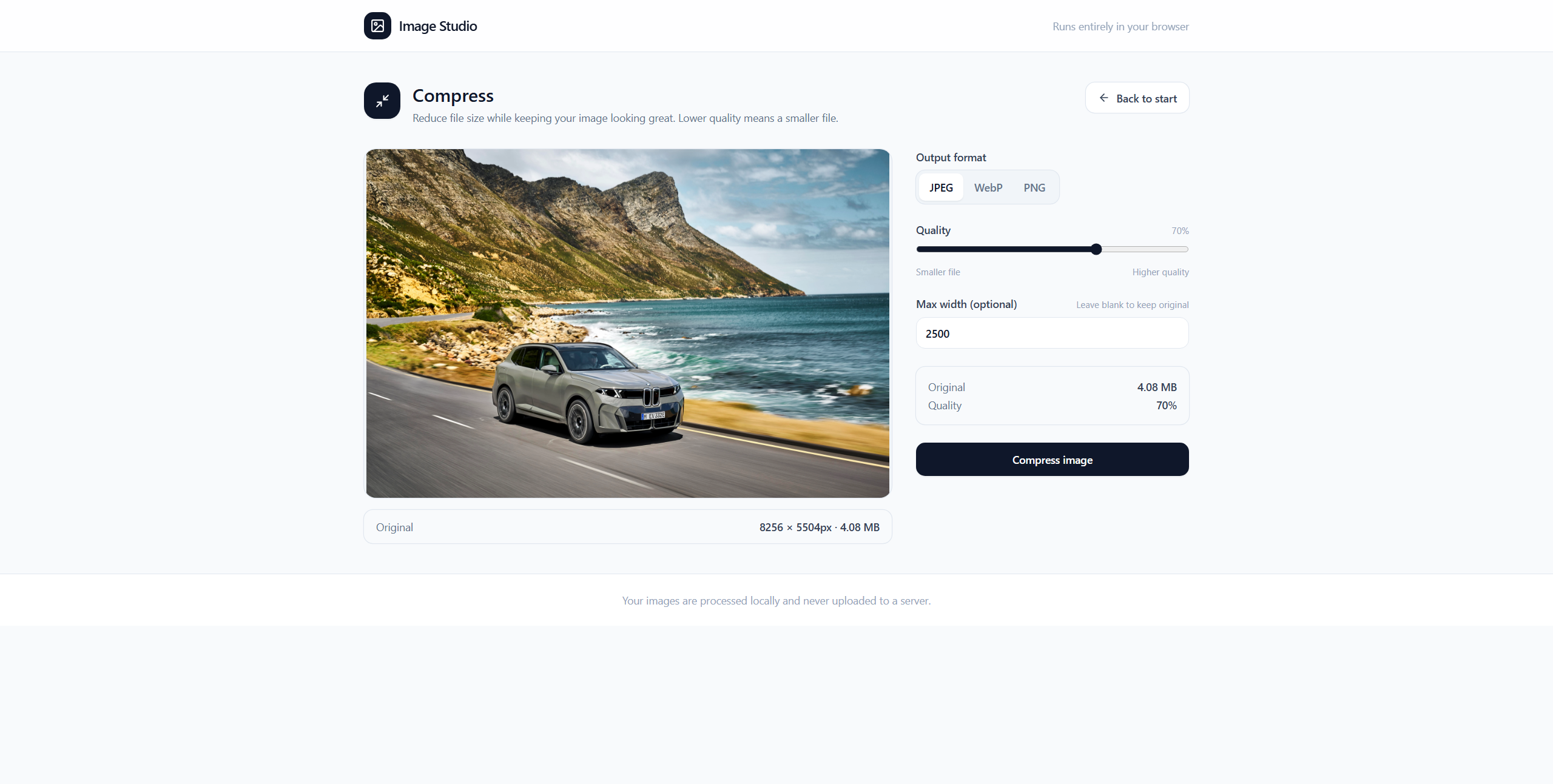
I designed and developed these tools, shaping the interfaces and input-to-output workflows for PDF Auto-Crop, SpeedSeed and Image Studio.
03 / AI-assisted development
I used AI development tools, including Bolt, to help build these browser utilities. I directed the workflows and interface design, then tested and refined the implementation for real production tasks.
Production utilities
Click through the source file, selection step and finished output for PDF Auto-Crop and SpeedSeed.
 01 / 04
PDF Auto-Crop — add the source file
Drop in an InDesign PDF and the utility prepares it for a clean, cropped JPEG export.
Image Studio
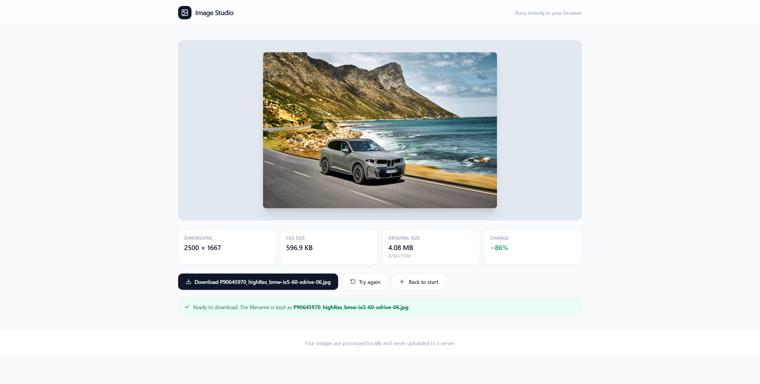
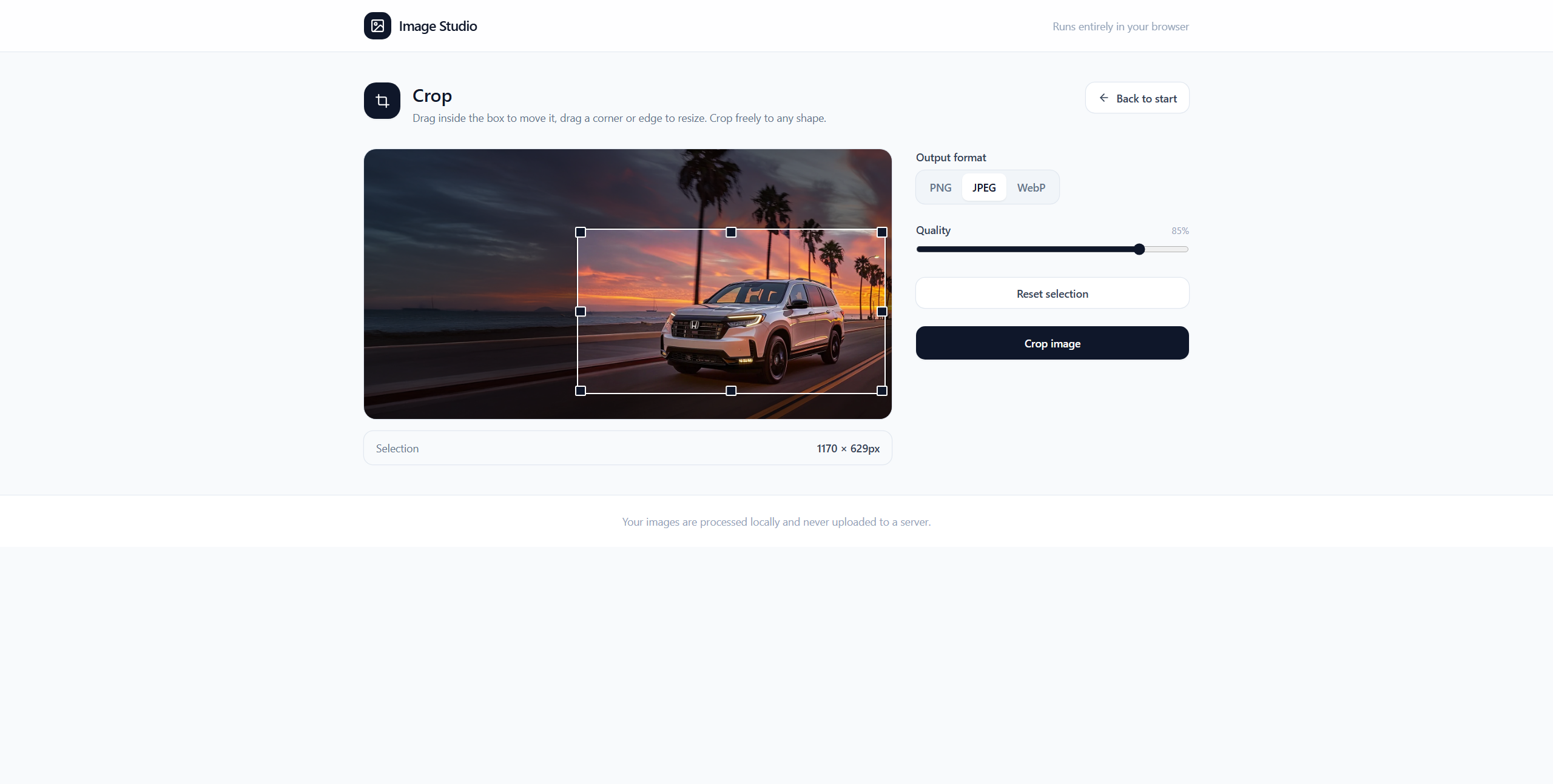
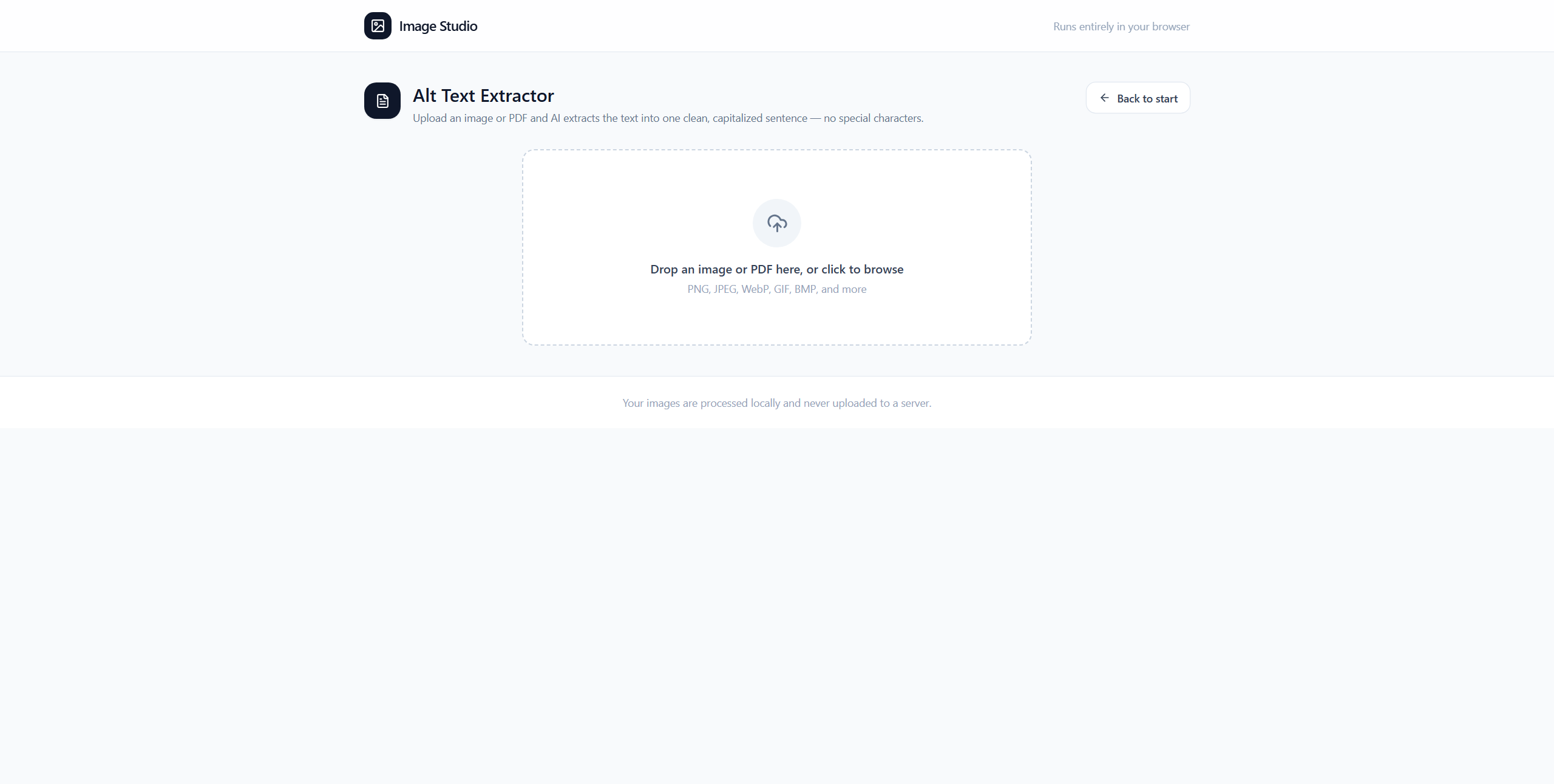
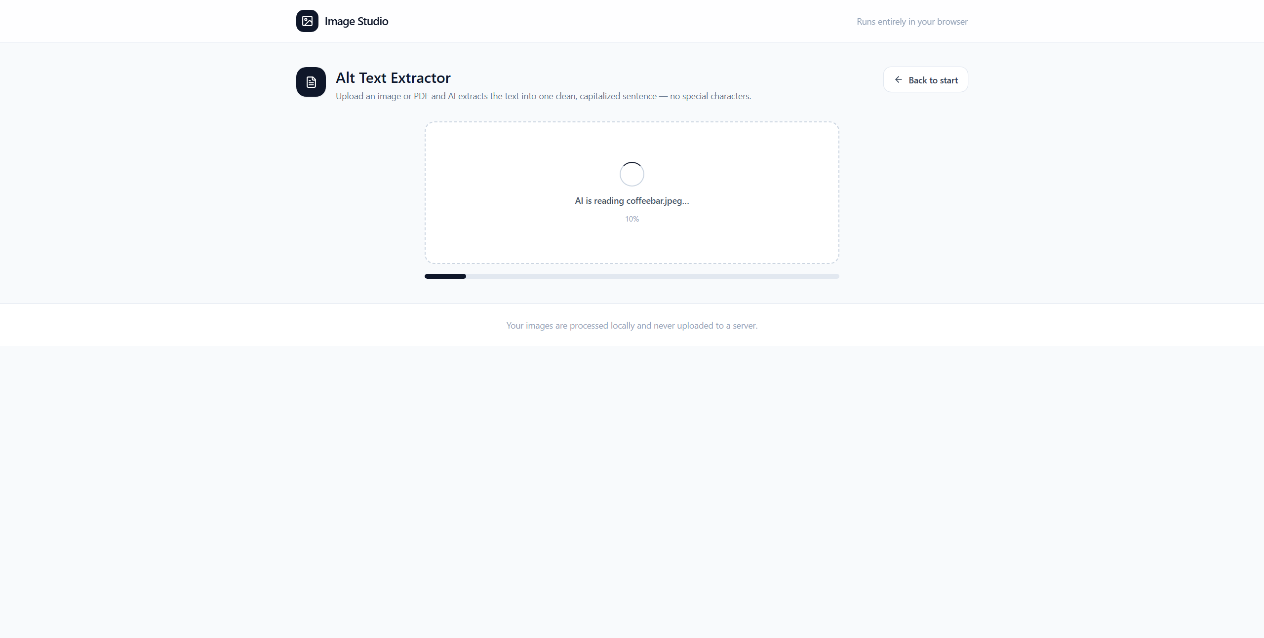
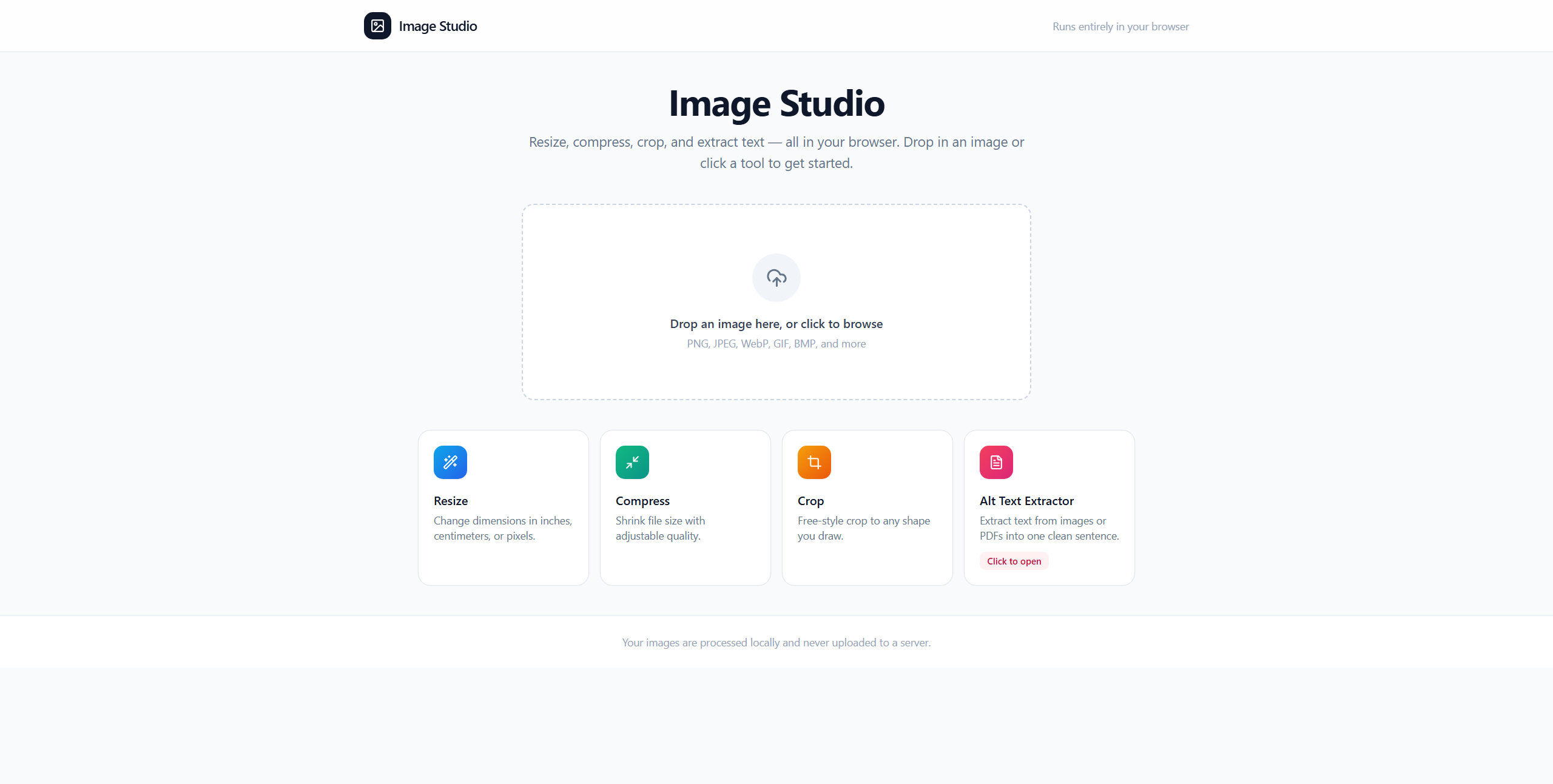
A browser-based image utility for resize, compression and crop, plus an AI-assisted alt-text feature that turns an image or PDF into a copy-ready description.
 01 / 10
Start with the tool hub
Choose resize, compression, crop or alt-text extraction from one browser workspace.
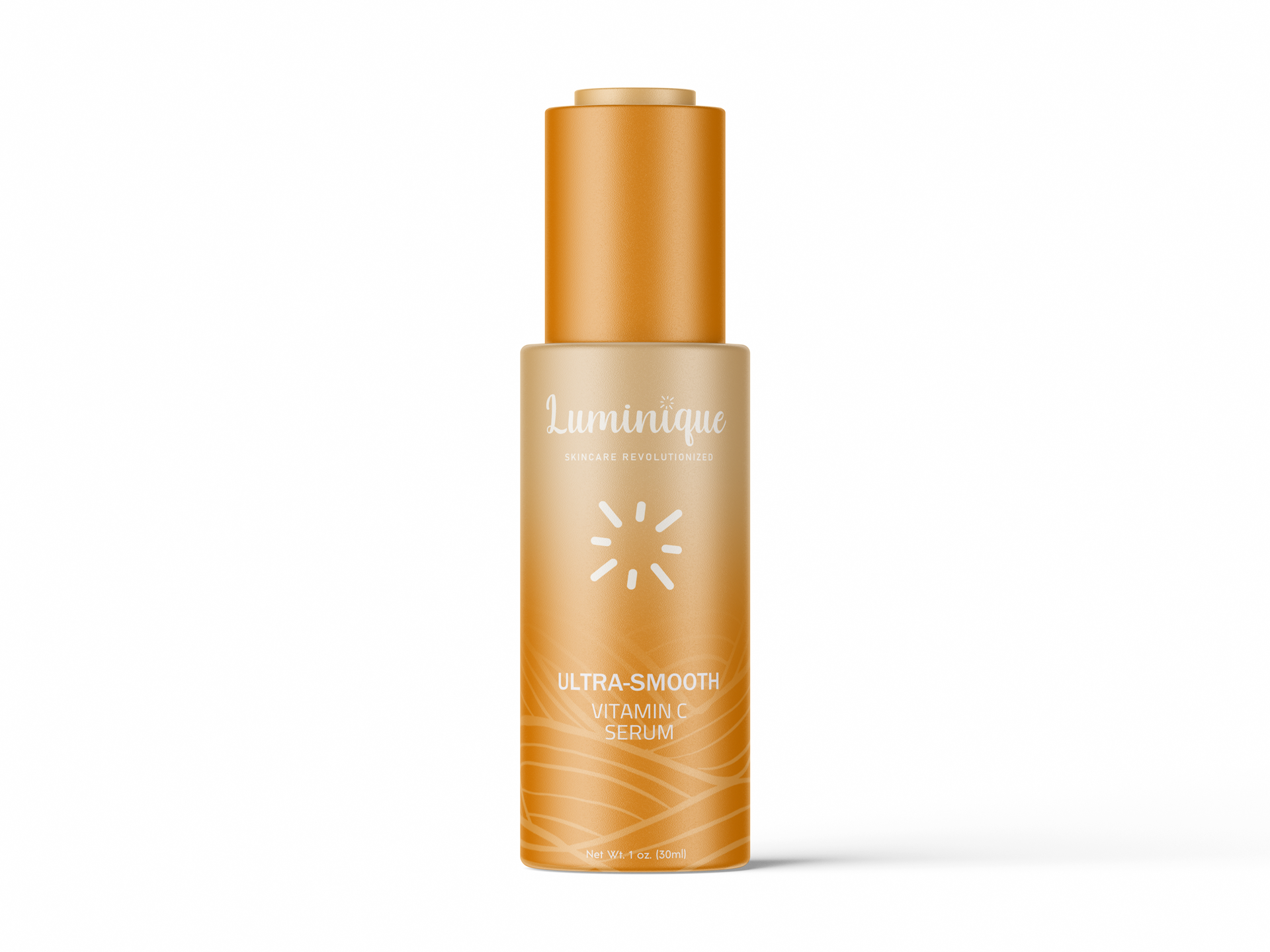
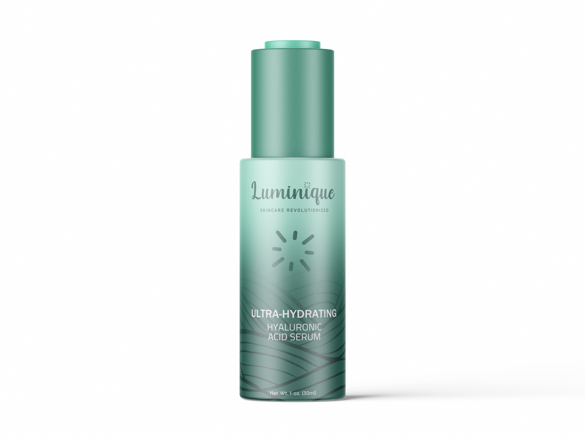
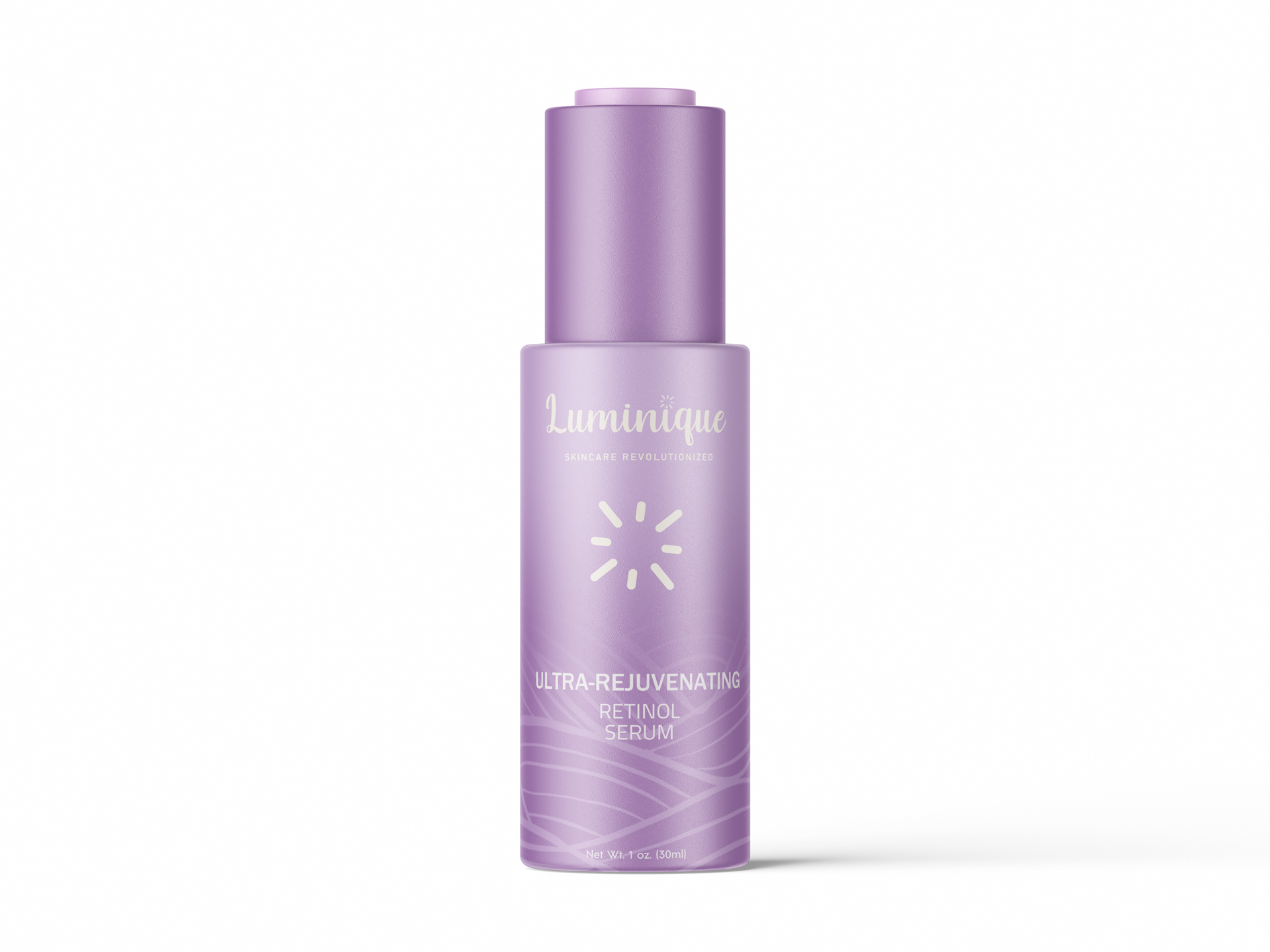
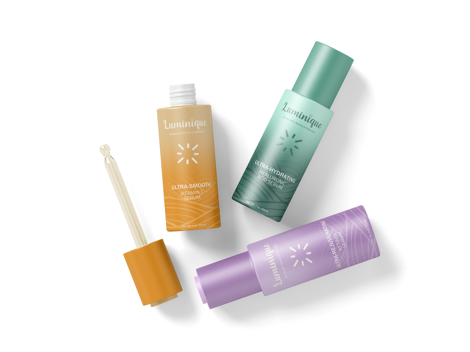
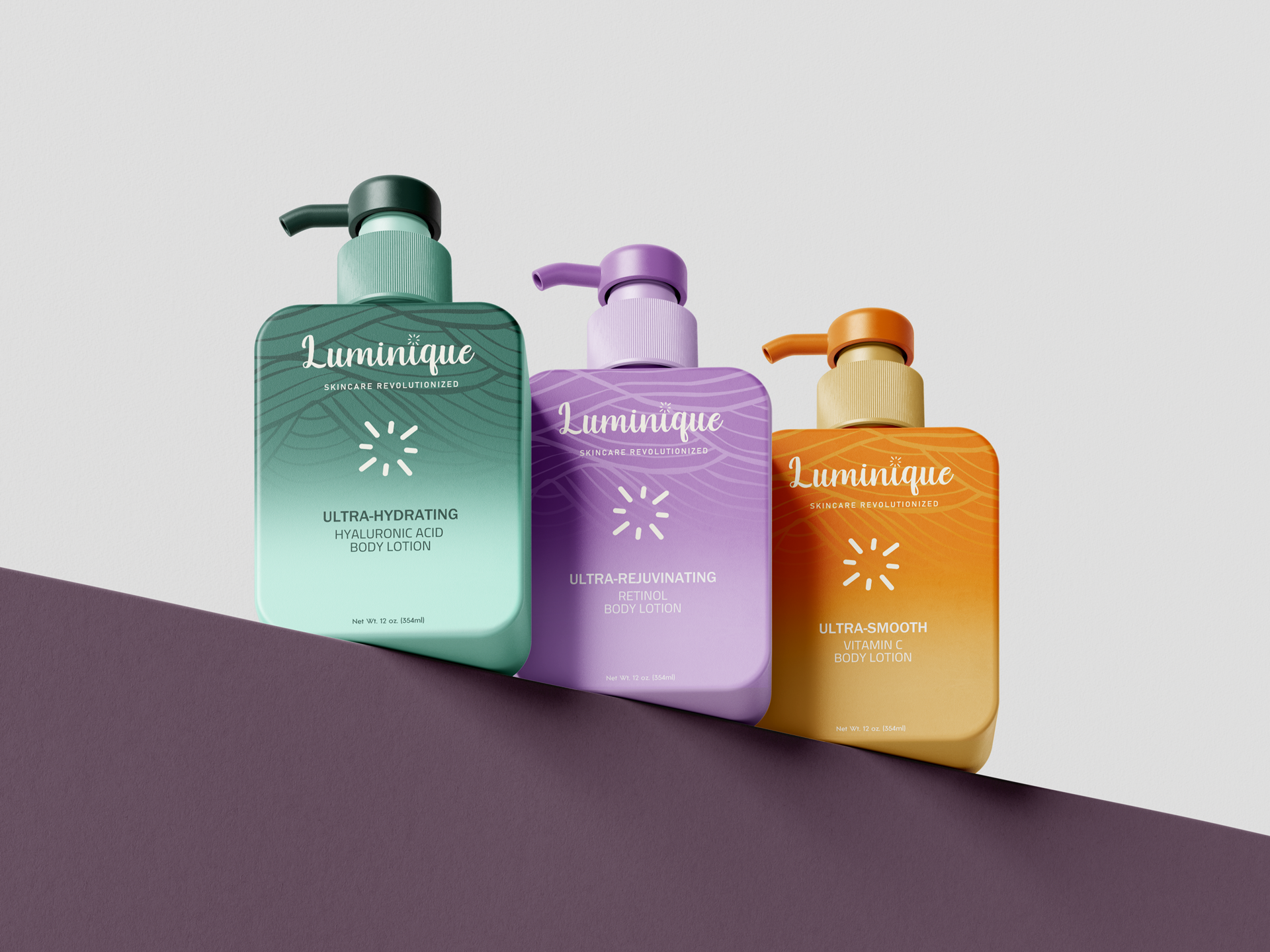
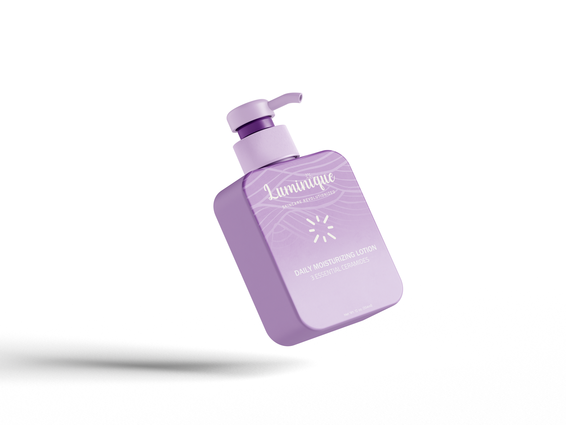
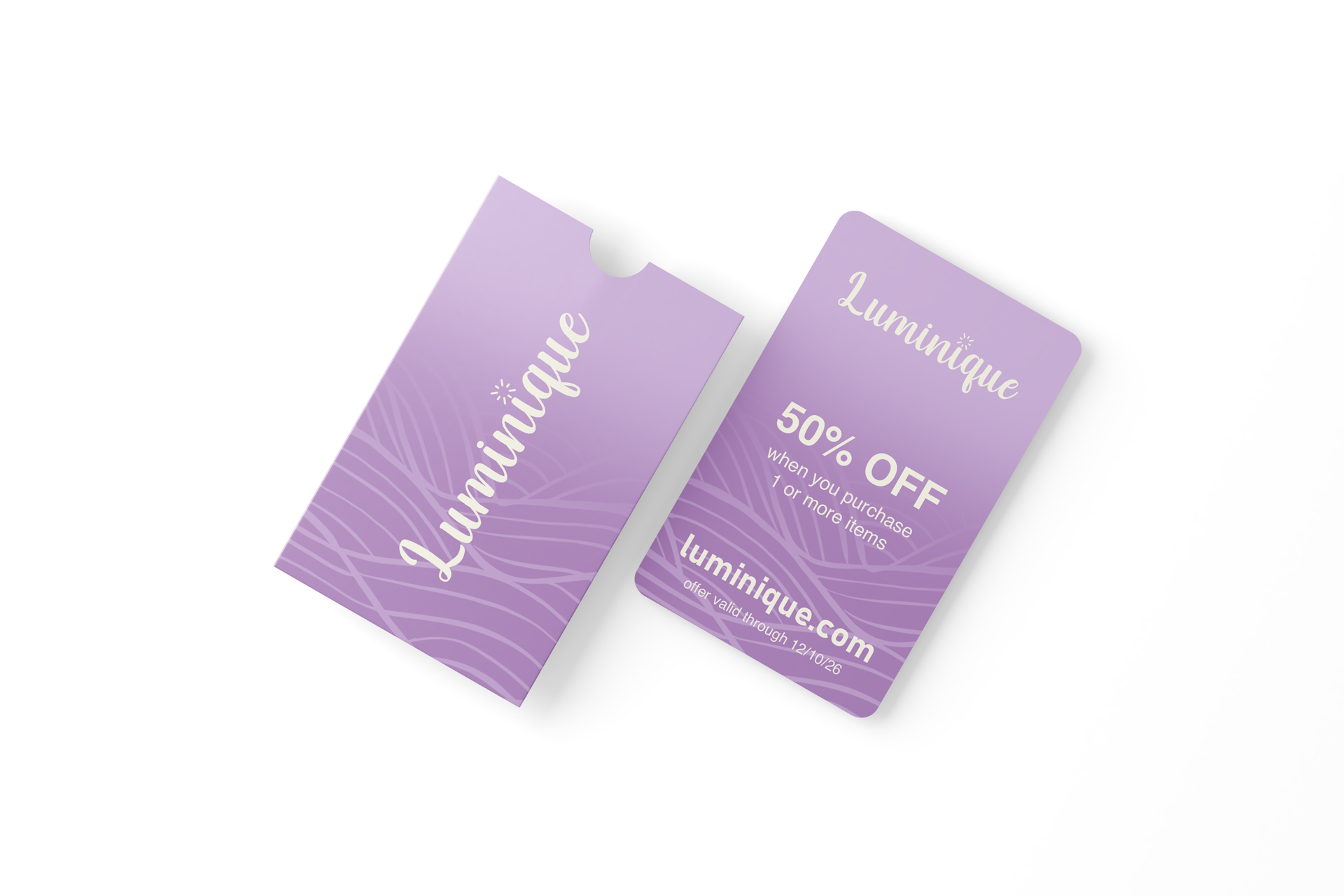
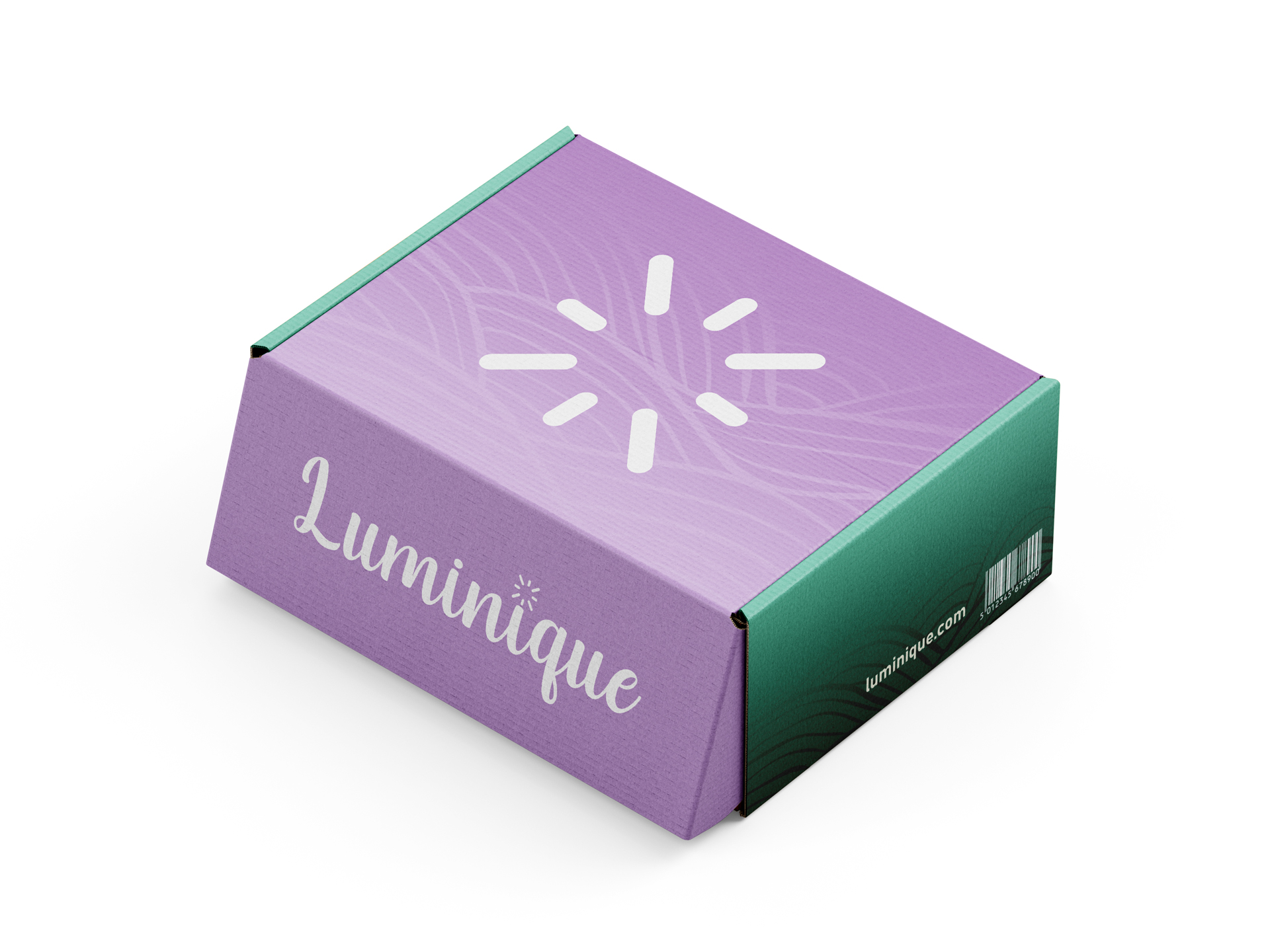
Completed brand identity, packaging, campaign and motion-graphic work for Luminique. The visual direction uses a custom wordmark, saturated color and a recurring line pattern to give the skincare range a distinctive presence across product, promotion and animation.
01 / Brief & constraints
Create a beauty identity with more visual energy than the category’s familiar neutral, minimal packaging while keeping each product easy to identify.
02 / My role
I created the wordmark, color palette, packaging graphics, campaign applications and motion graphics. Key choices included a hand-drawn wordmark for warmth, saturated color to separate formulas and a recurring line pattern to connect the range.
03 / Finished work
Finished applications include product packaging, outdoor posters, gift cards, a shipping box, a color-coded product family and a vertical motion graphic.
Identity foundation
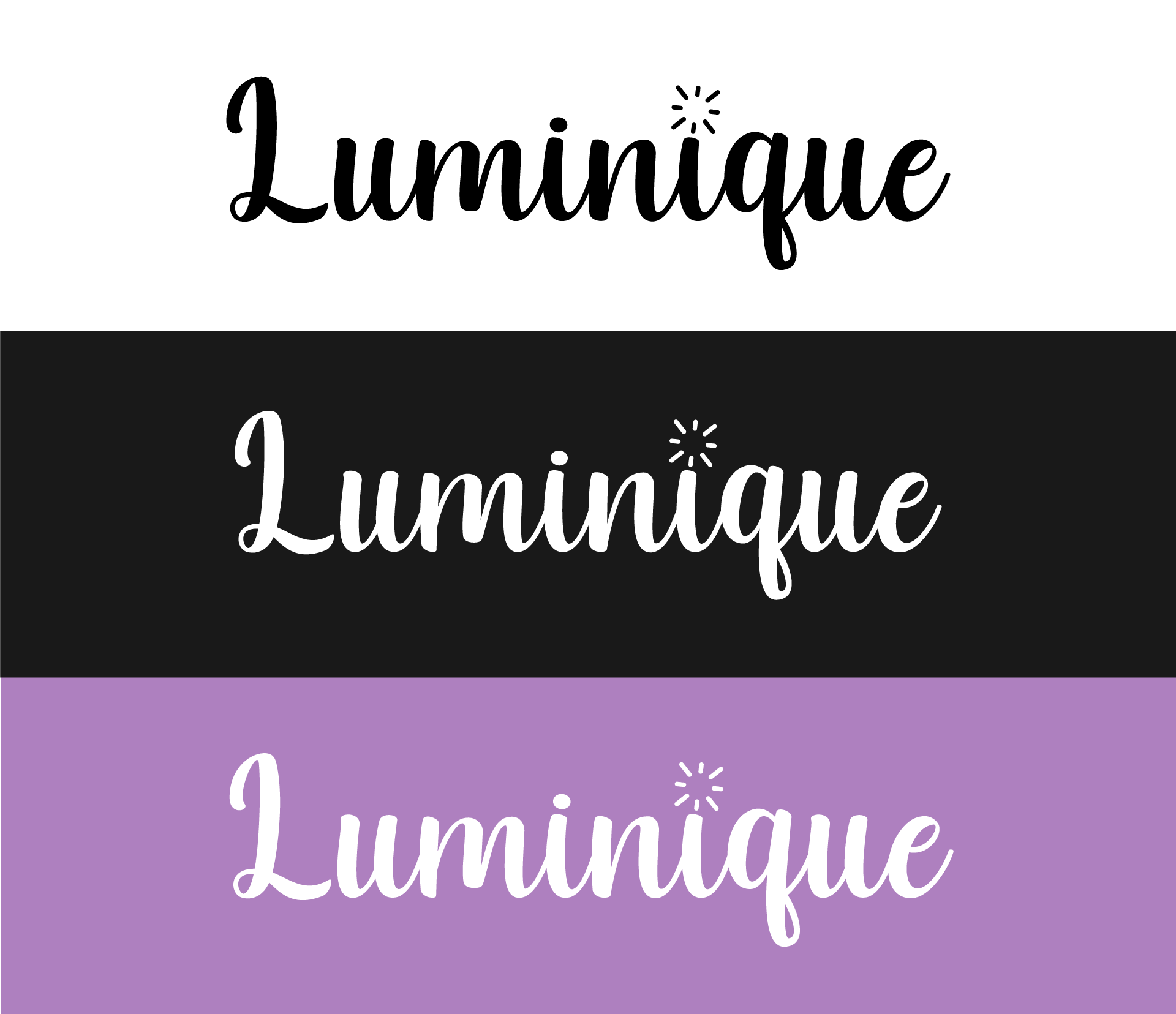
The Luminique wordmark brings a human counterpoint to the polished packaging forms. Its custom rhythm and small radiant mark carry across light, dark and color-led applications, creating a recognizable signature without relying on a sterile cosmetic aesthetic.
Product language
The color system gives each formula a distinct point of view while the logo, burst mark and pattern keep the line cohesive.
Luminique in motion
A vertical motion piece extends the Luminique visual language across color, product and type.
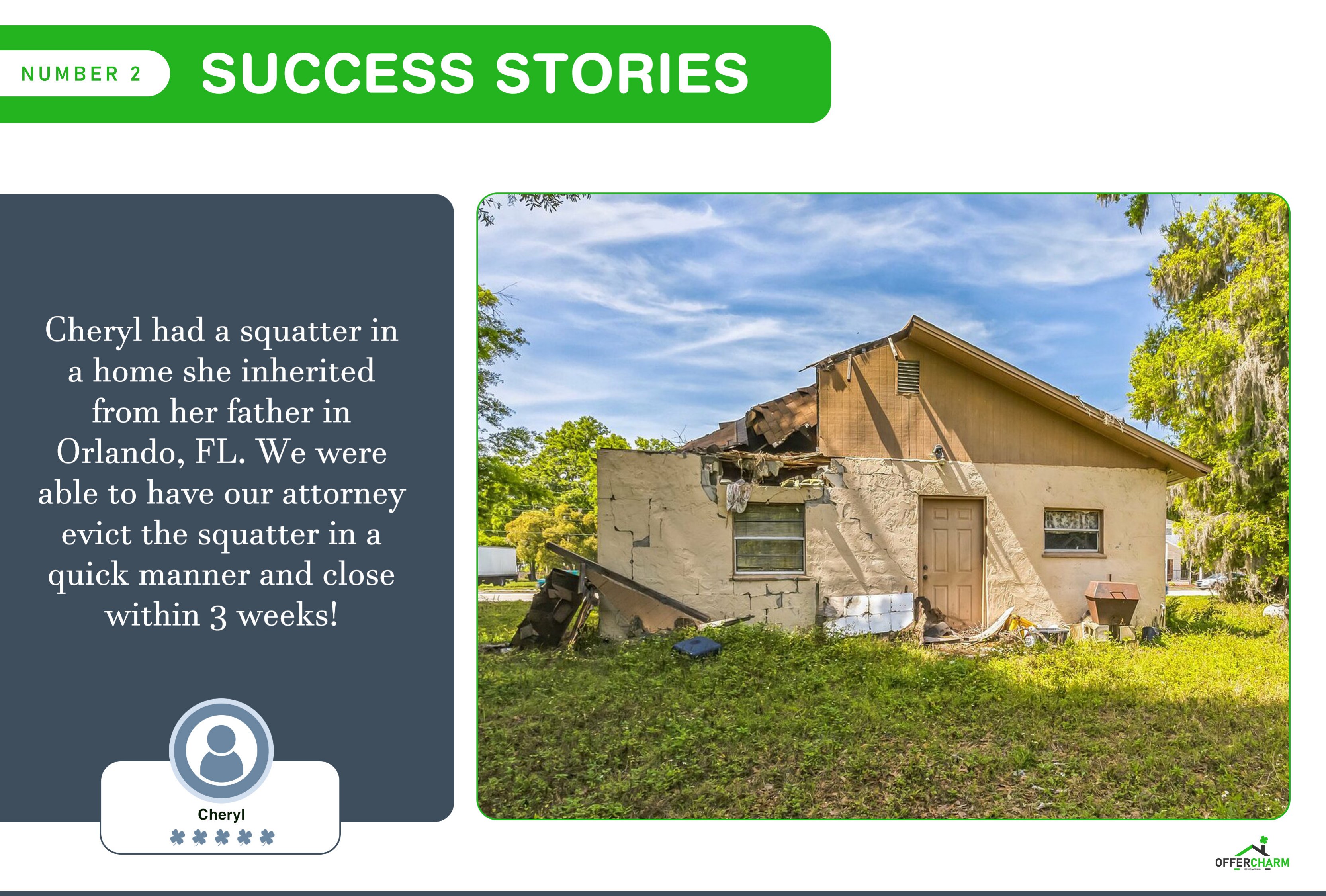
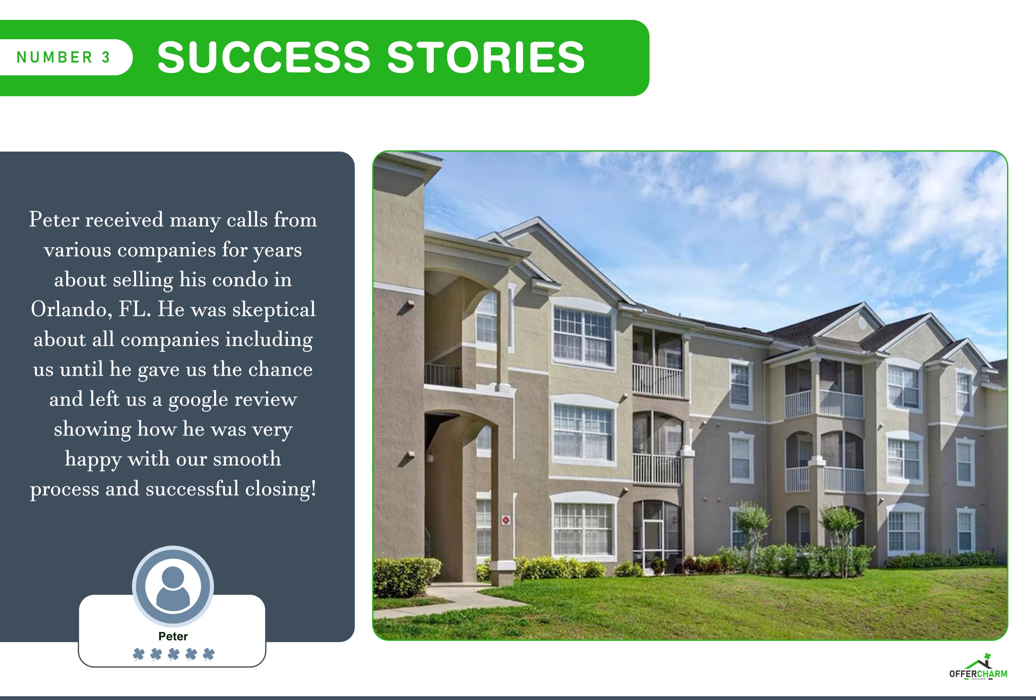
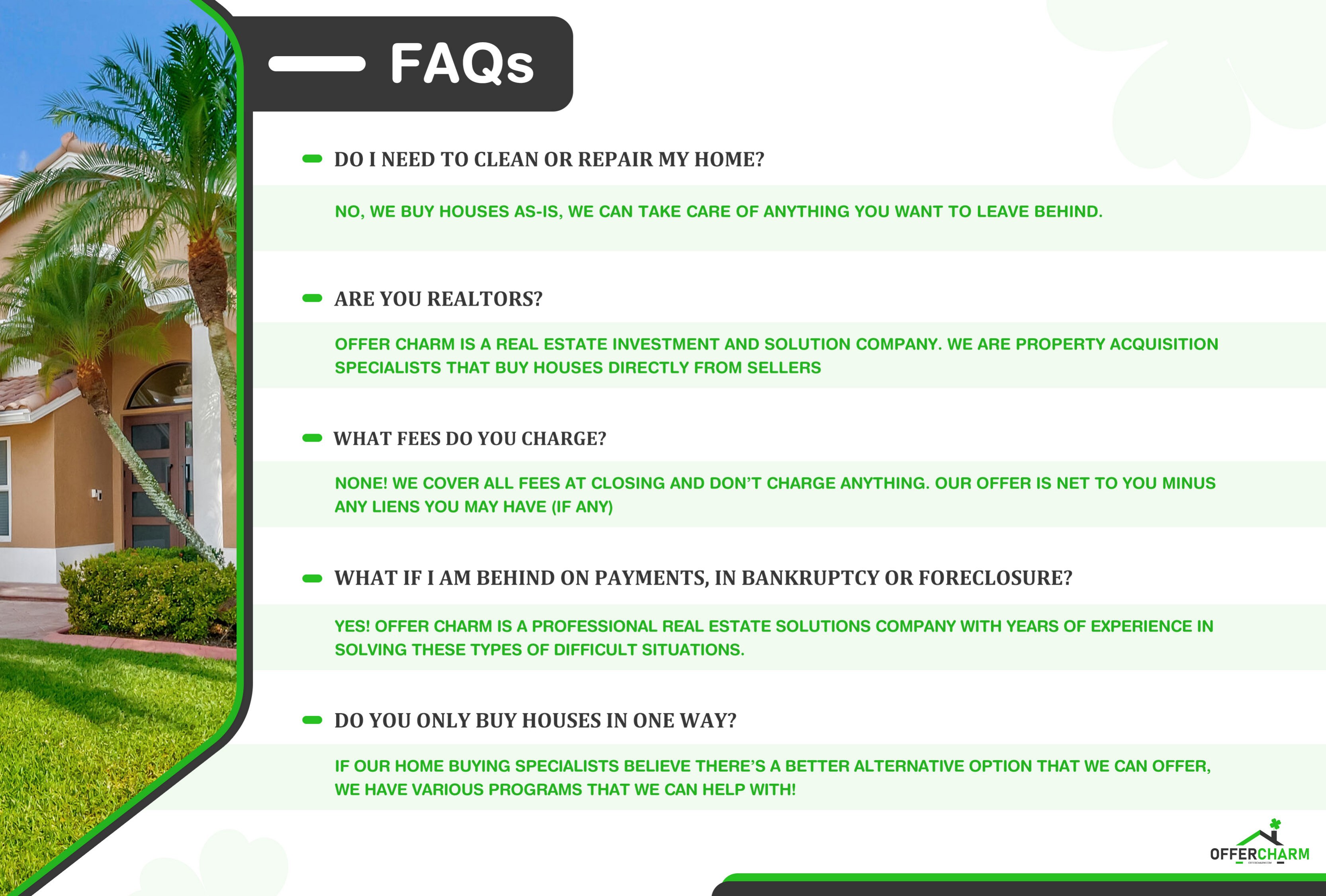
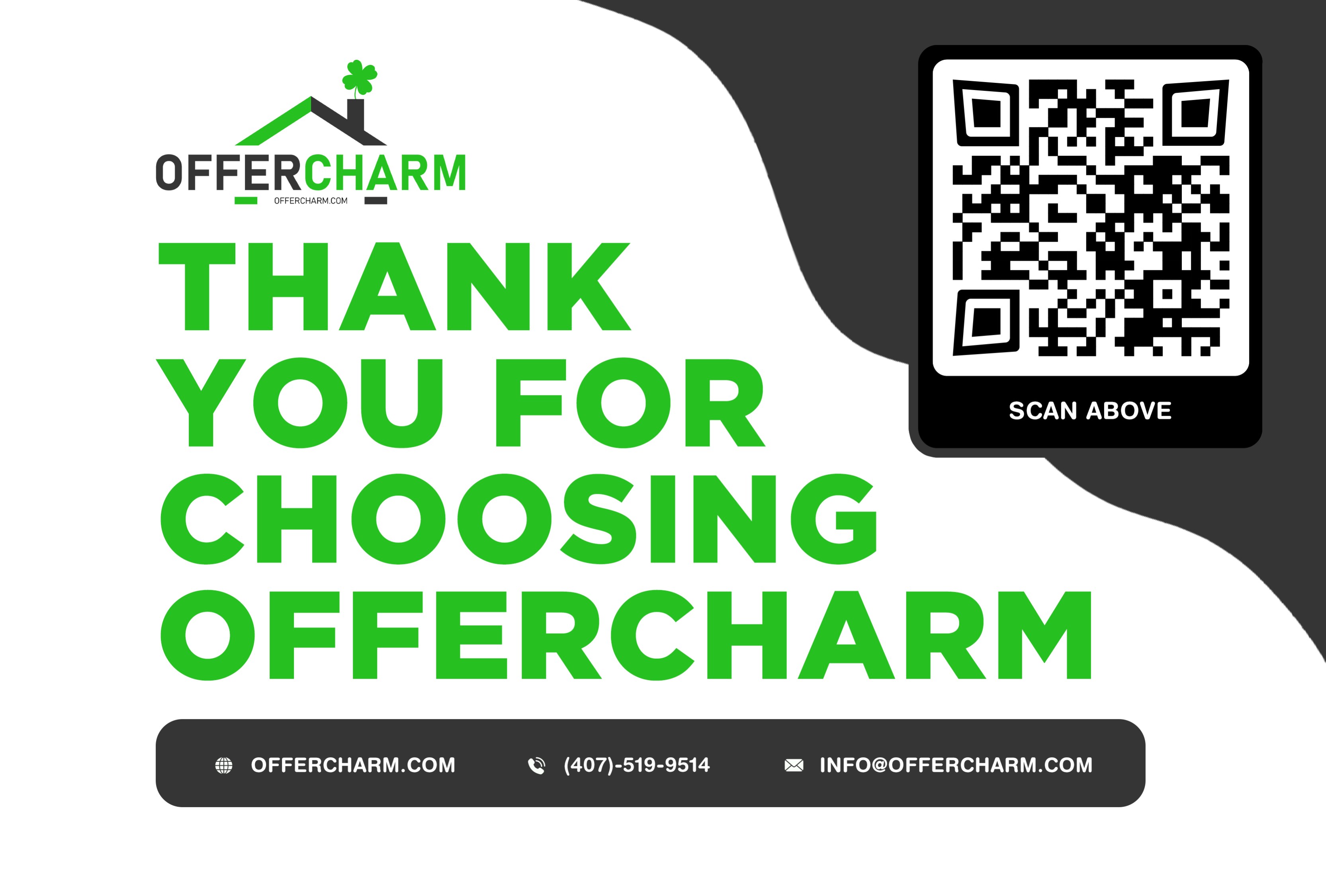
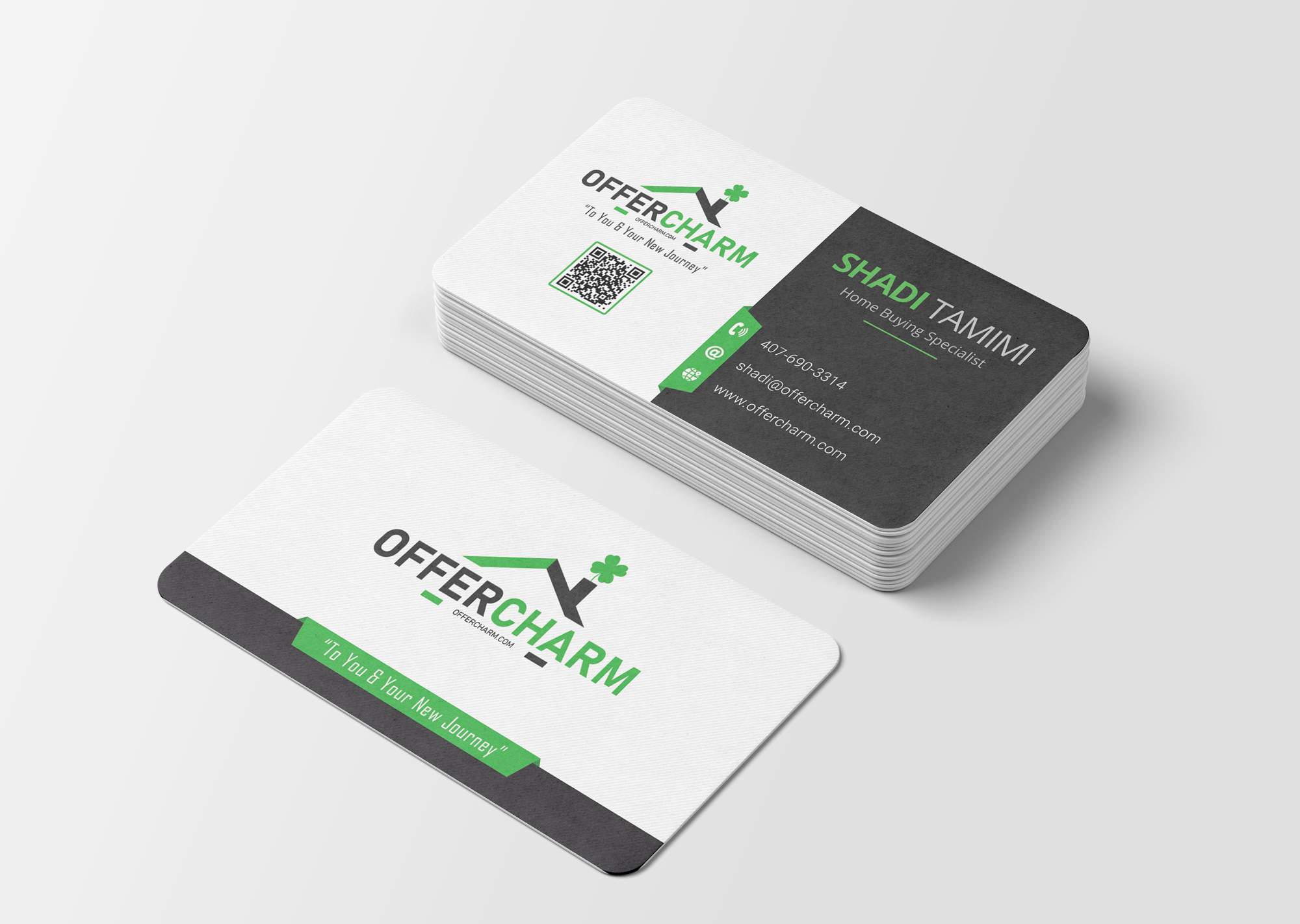
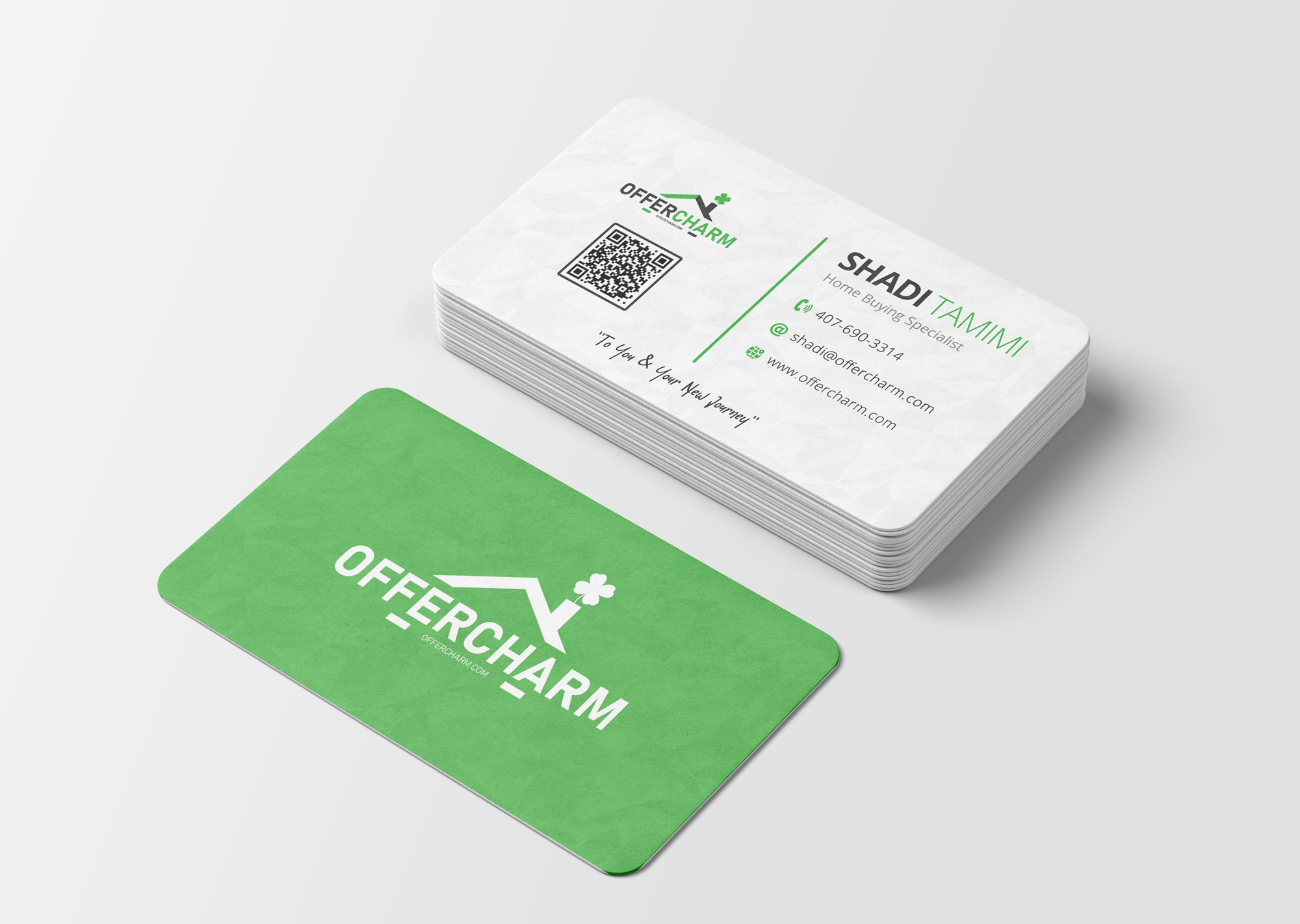
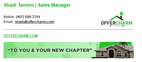
Commissioned by CEO Shadi Tamimi, I created the branding and design work for OfferCharm and its affiliated company, SetHomes Realty. The project includes identity marks, business cards, email signatures, a seller guide and supporting visual applications.
01 / Brief & constraints
Create two related real-estate identities that feel connected under Shadi Tamimi’s leadership while keeping their individual character.
02 / My role
I created the brand identities and designed the business cards, email signatures, seller guide layout and supporting visual applications shown here.
03 / Finished work
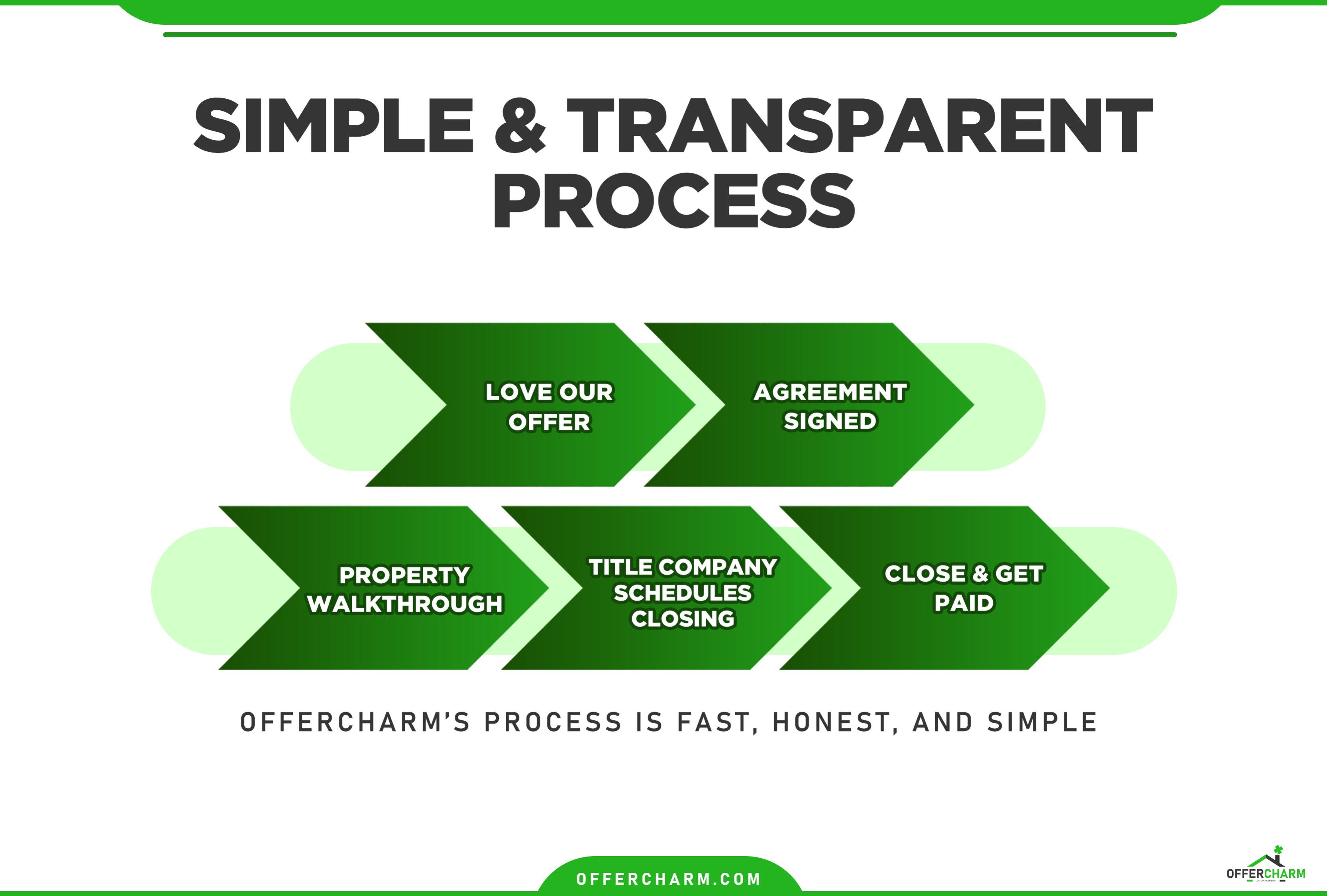
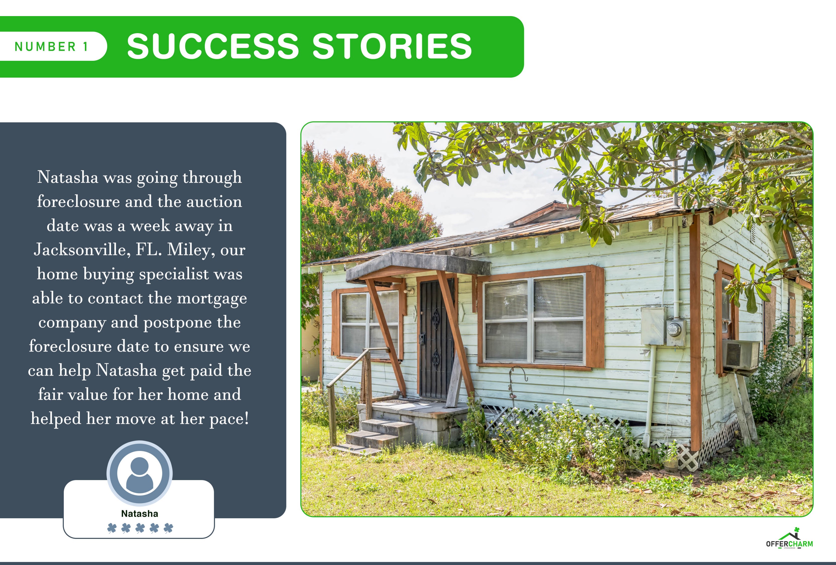
The work includes two identity marks, printed business cards, two email signatures, core-values artwork and an eight-page seller guide.
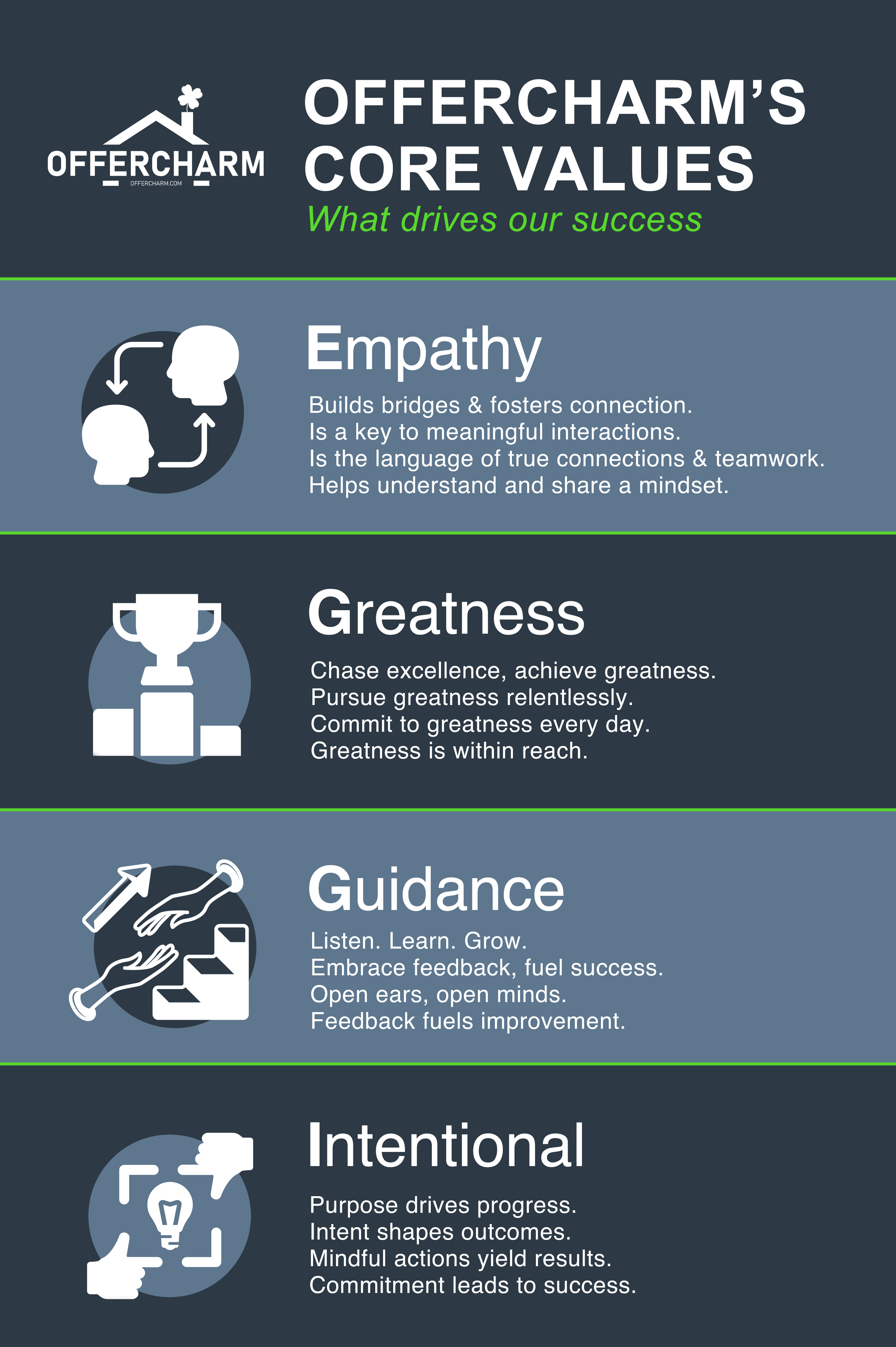
A promise with personality
The guide turns OfferCharm's core values—empathy, greatness, guidance and intention—into more than internal language. They become visible proof of how the brand shows up for a homeowner at every stage.
Identity in use
The identity is carried through personal, relationship-building details: business cards, email signatures and the marks that anchor each company.


Seller guide
Use the previous and next controls to move through the eight-page seller journey.
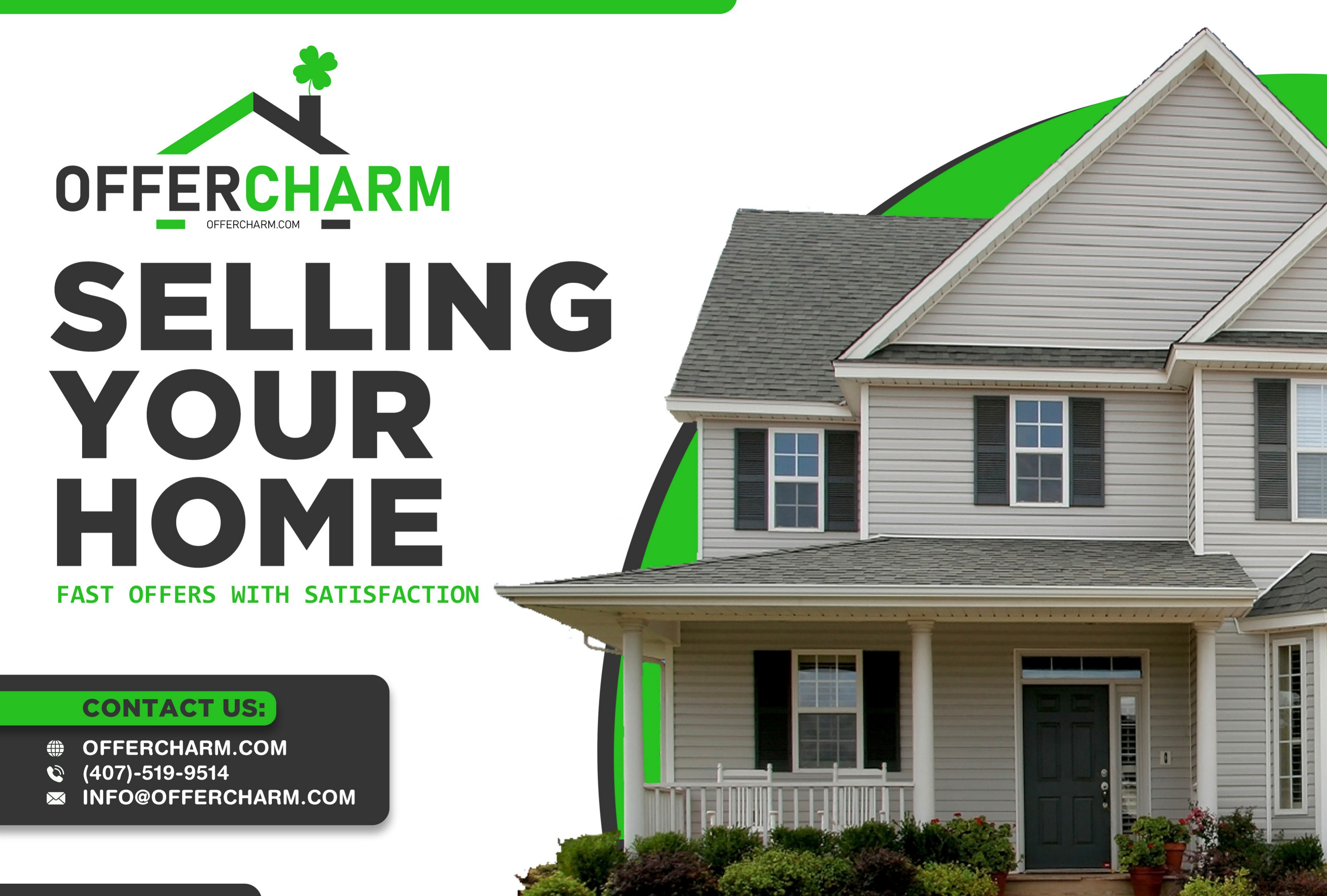 01 / 08
Cover - sell your home on your terms
A direct promise sets a reassuring, homeowner-first tone from the first page.
Contact
Big challenge or small detail, let’s find the design solution that fits. Get in touch.